Living Room Paint Ideas: Colors, Combinations, and Styling Tips
Paint transforms a space in a way no other single upgrade can match. For a few hundred dollars and a weekend, you can shift your living room from dated to design-forward, from cramped to expansive, from sterile to warm. No furniture purchase, no rug swap, no lighting refresh delivers that kind of broad, immediate impact.
The living room is where you host, unwind, and spend the bulk of your waking hours at home. Getting the color right pays dividends every single day. This guide covers everything you need to confidently choose a palette, from understanding light and proportion to popular color directions, ceiling strategy, accent walls, and furniture pairing.
How to Choose a Living Room Paint Color
Choosing paint starts before you ever pick up a swatch. The right color for your living room depends on the fixed elements already in place: how much natural light the room receives, how large or small the space is, and what your furniture is already doing.
Light Direction
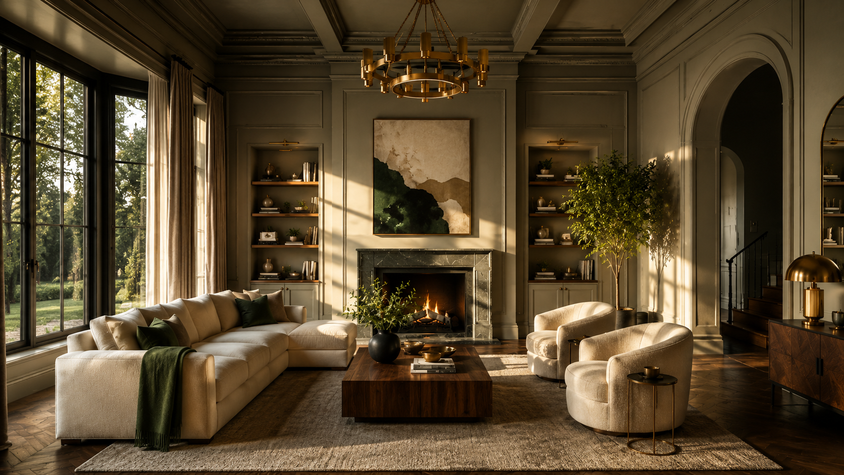
Natural light direction is a critical, commonly overlooked variable in paint color selection. North-facing rooms receive cool, indirect light throughout the day. In those spaces, cool blues and grey-toned whites can read as flat or cold. Warm whites, soft terracottas, and creamy greiges work better because they supply the warmth that indirect light cannot.
South-facing rooms get consistent, warm sunlight for most of the day, which means they can hold almost any color confidently, from deep jewel tones to crisp cool whites.
East-facing rooms are bright and warm in the morning and shift to cooler, lower light by afternoon. Warm mid-tones, earthy greens, and muted golden tones tend to read well across that range.
West-facing rooms do the reverse, typically starting dim and cool and warming up dramatically in the late afternoon and evening. Rich, warm shades and deep saturated hues come alive in that golden afternoon light.
Room Size and Proportions
Lighter tones do expand a space visually, but you are never limited to white. A soft sage, a muted dusty blue, or a warm greige can feel just as open and airy as a bright white while adding considerably more depth and personality.
What matters as much as the specific hue is the finish you choose. Matte and flat finishes absorb light. An eggshell or satin finish reflects light back into the space, creating openness regardless of the color.
Your Existing Furniture
Paint color does not exist independently of what is already in the room. Your sofa, area rug, shelving, and any built-in elements are fixed points that your wall color needs to complement.
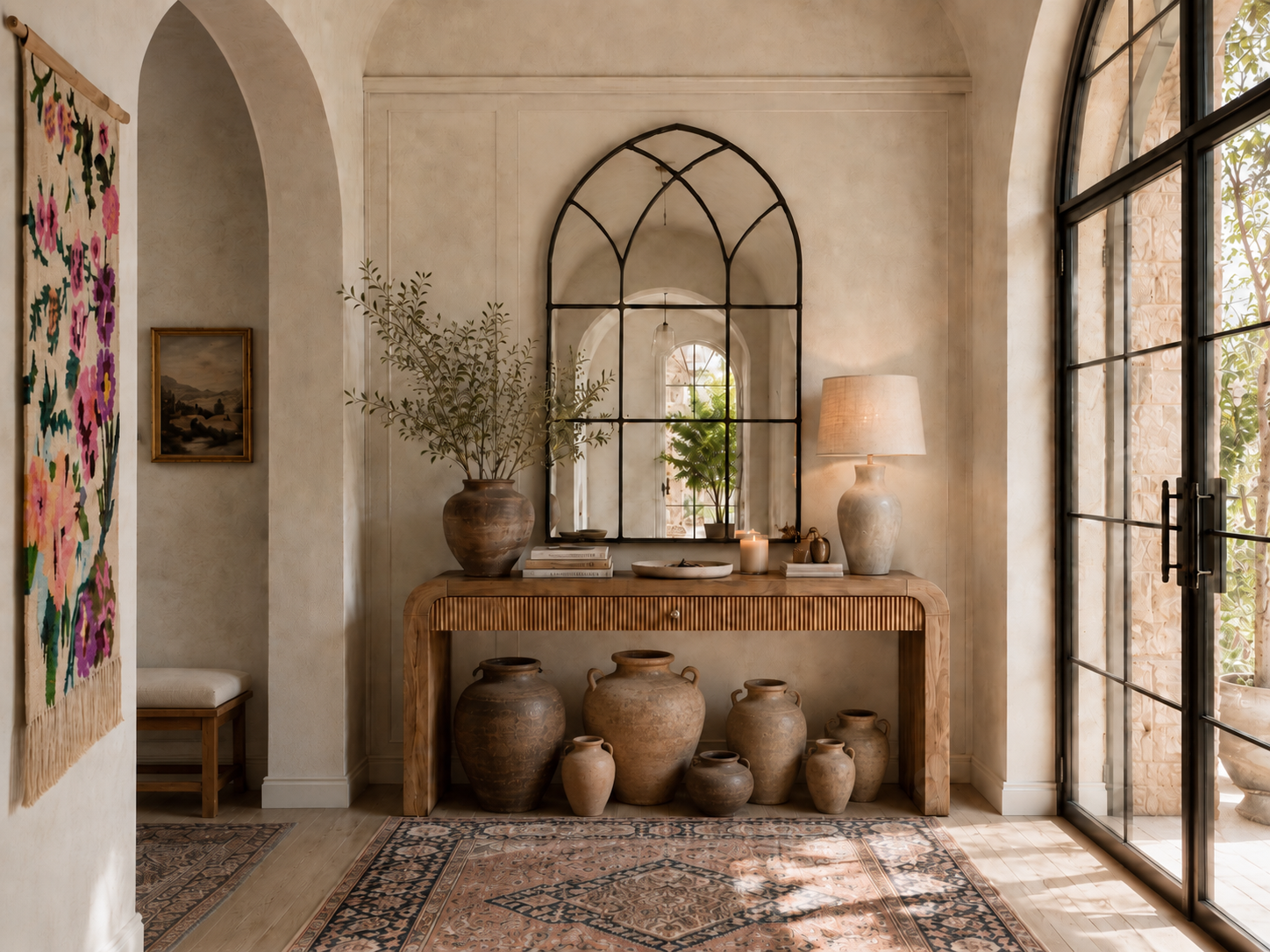
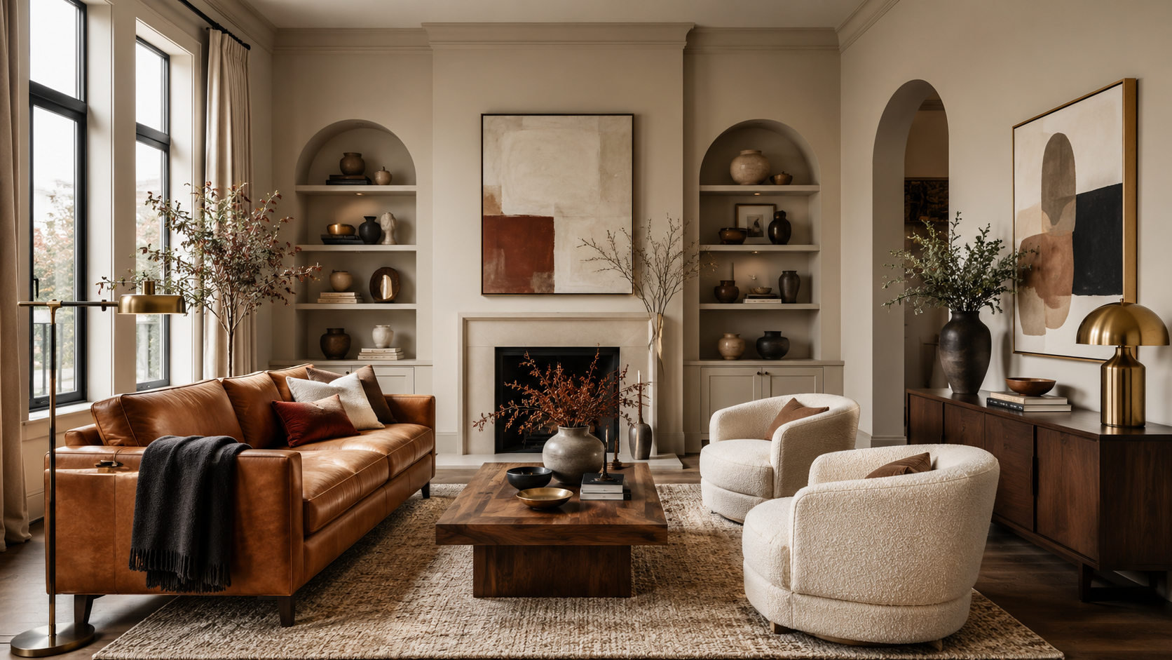
Start by identifying the undertones in your largest furniture pieces. A warm-toned leather sofa with amber or caramel notes calls for walls that are similarly warm, or at minimum neutral. A mid-century modern sofa in cool charcoal can anchor a room in a cool, minimal palette or work beautifully against a warm earthy background.
For a more detailed approach to building a palette from your existing pieces, our guide to how to choose a color scheme covers the process start to finish.
Popular Living Room Paint Palettes
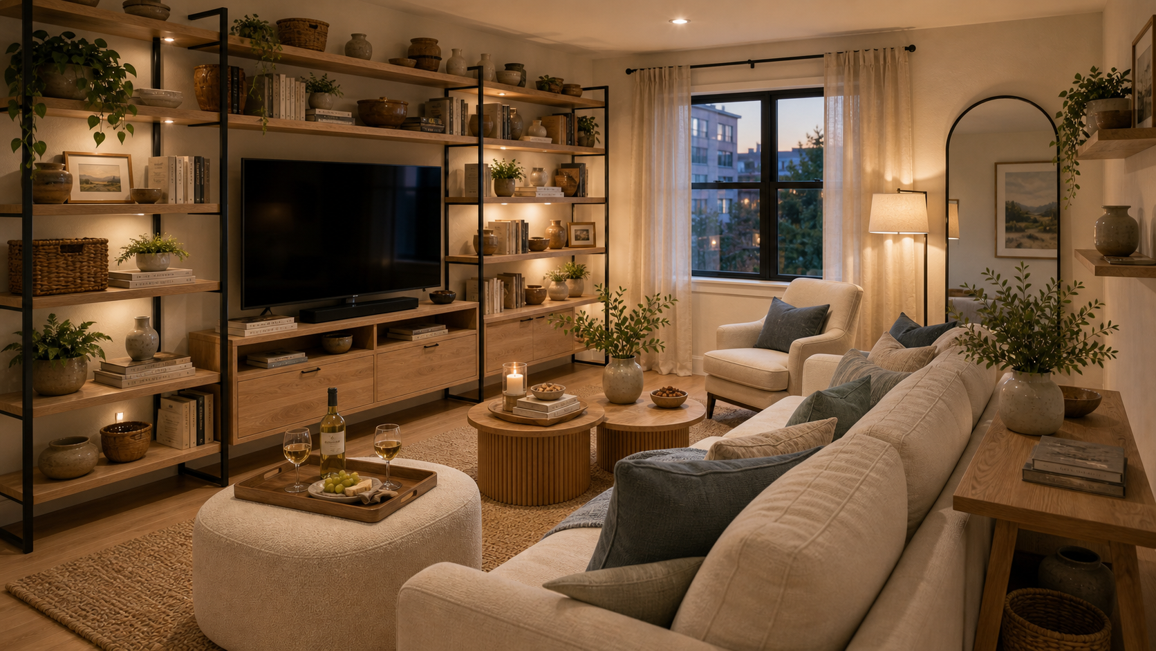
Warm Whites and Creamy Neutrals
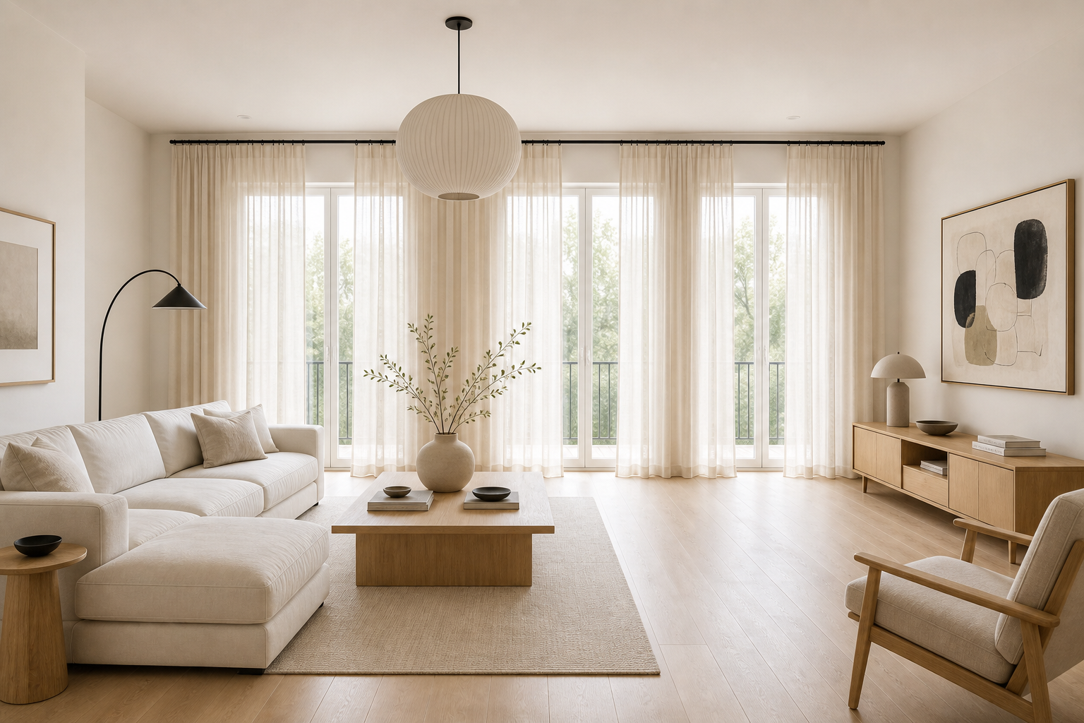
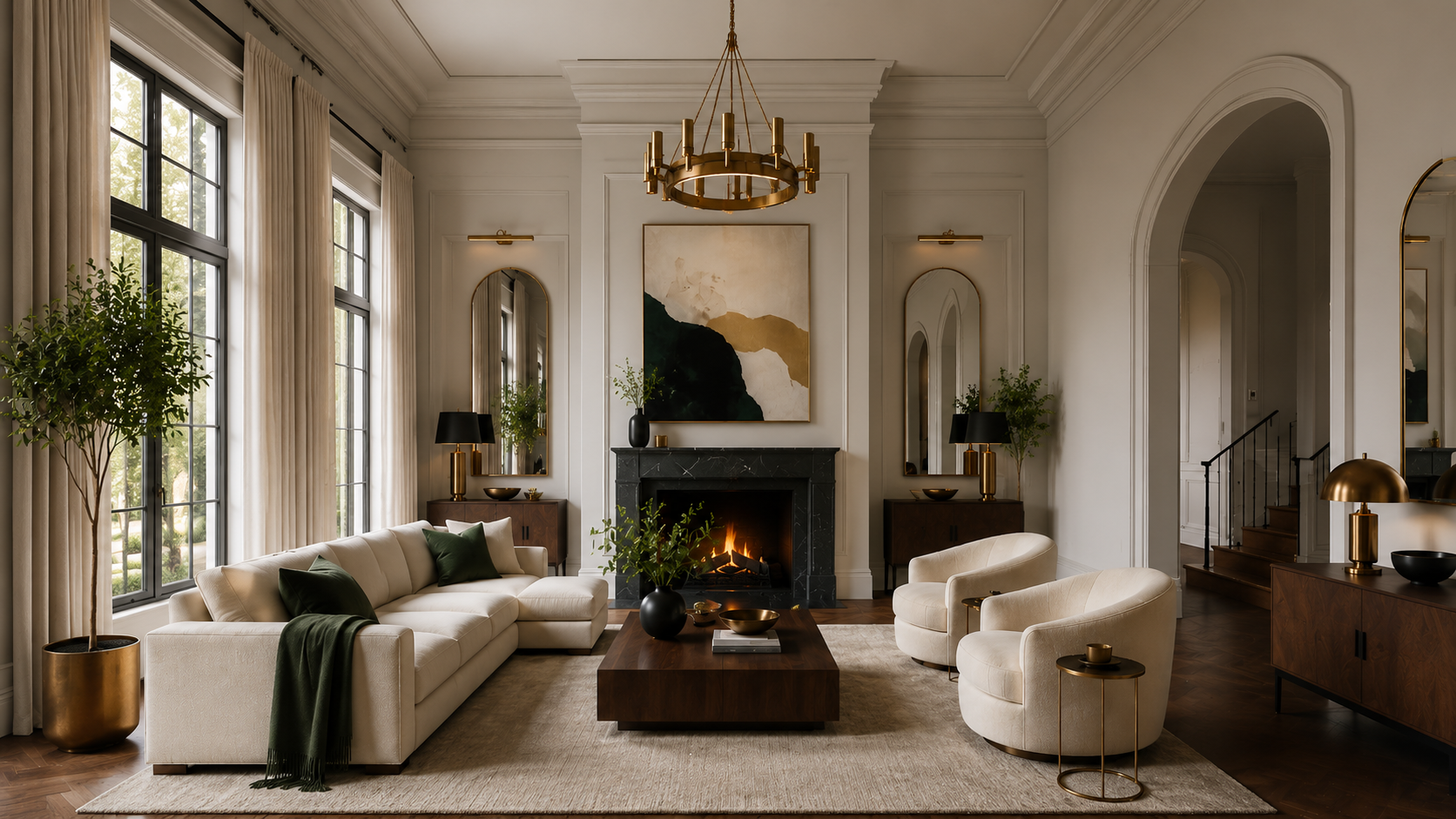
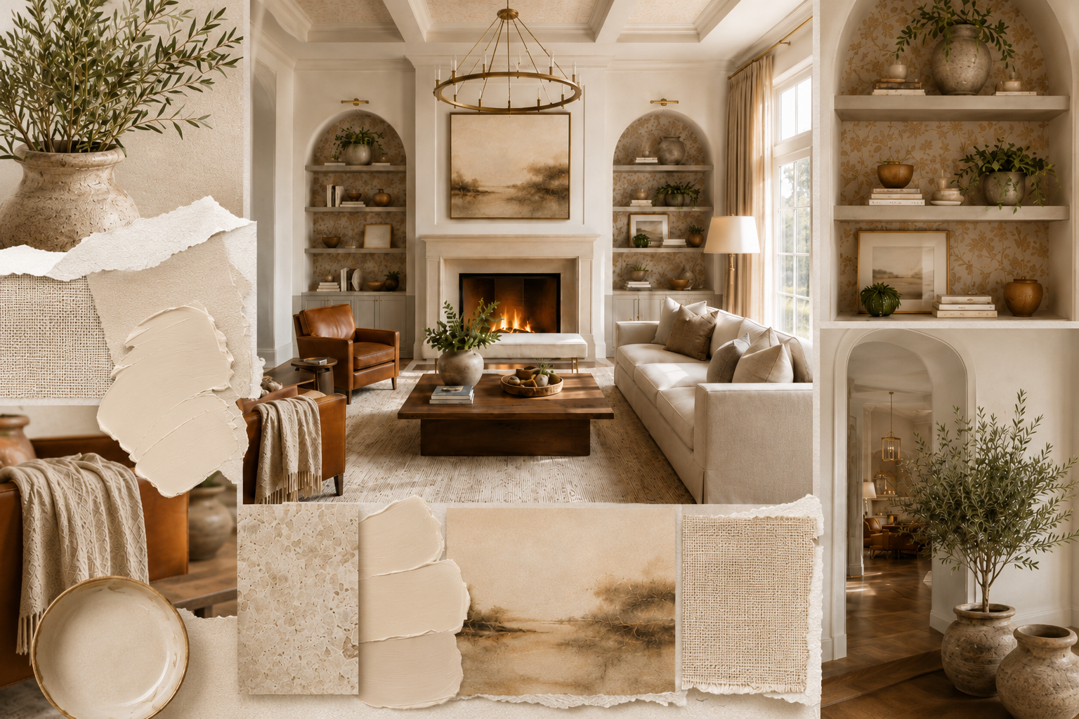
Warm whites and off-whites hold their ground year after year for a simple reason: they work in almost every space. But there is a meaningful difference between a true pure white, which can read as clinical and cold in many light conditions, and the warm, creamy whites that make a room feel genuinely inviting.
Look for whites with yellow, beige, pink, or peach undertones. Shades described as linen, alabaster, bisque, cream, or warm ivory all tend to fall into this category. Soft greiges, which sit between warm grey and beige, are equally flexible and feel a step more layered than a simple white.
Top picks:
- Sherwin-Williams Alabaster (SW 7008) The internet's most-discussed warm white. Yellow-beige undertones, versatile in most light conditions.
- Behr Wheat Bread (720C-3) A proven bestseller at Home Depot. Warm greige that reads as slightly richer than white.
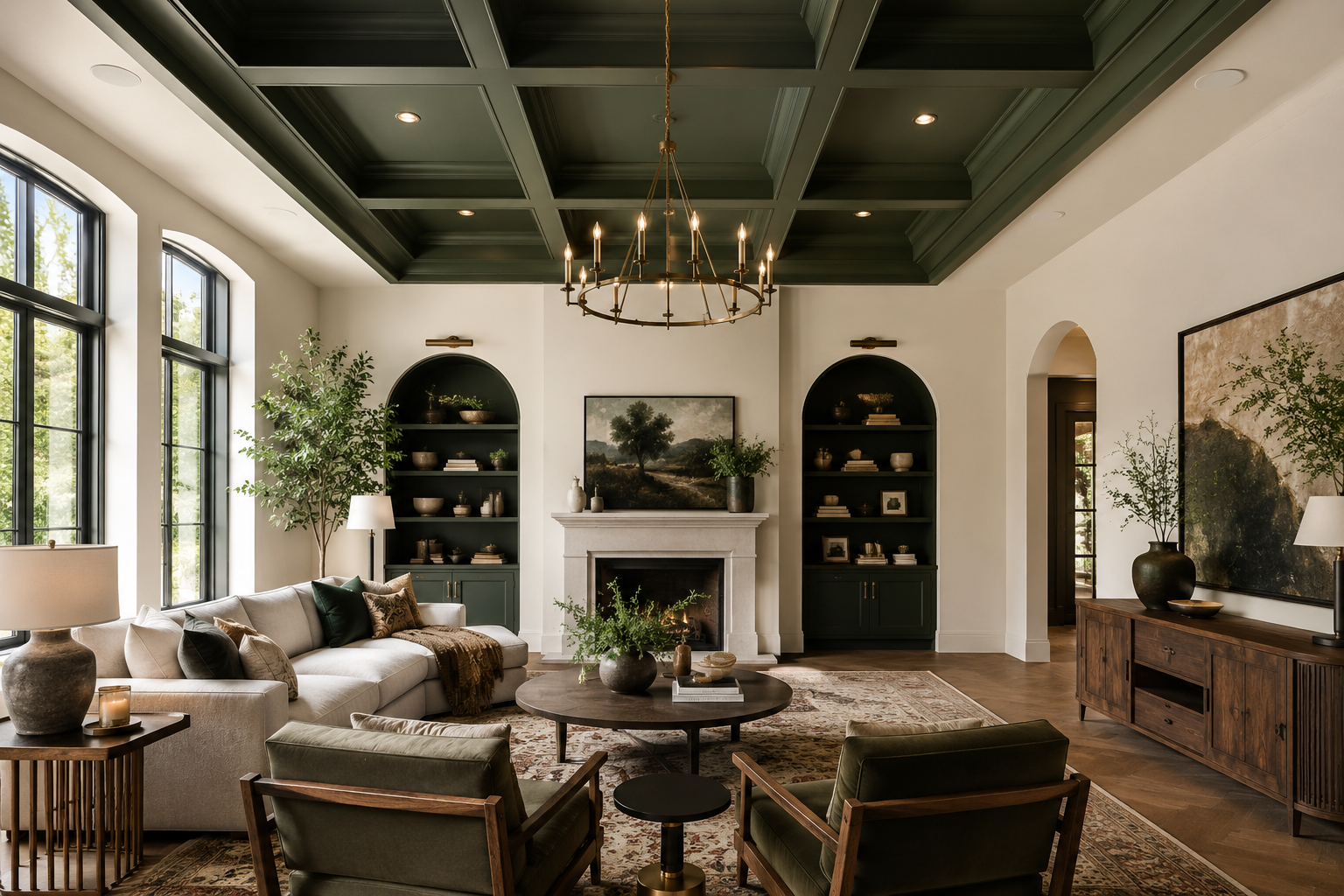
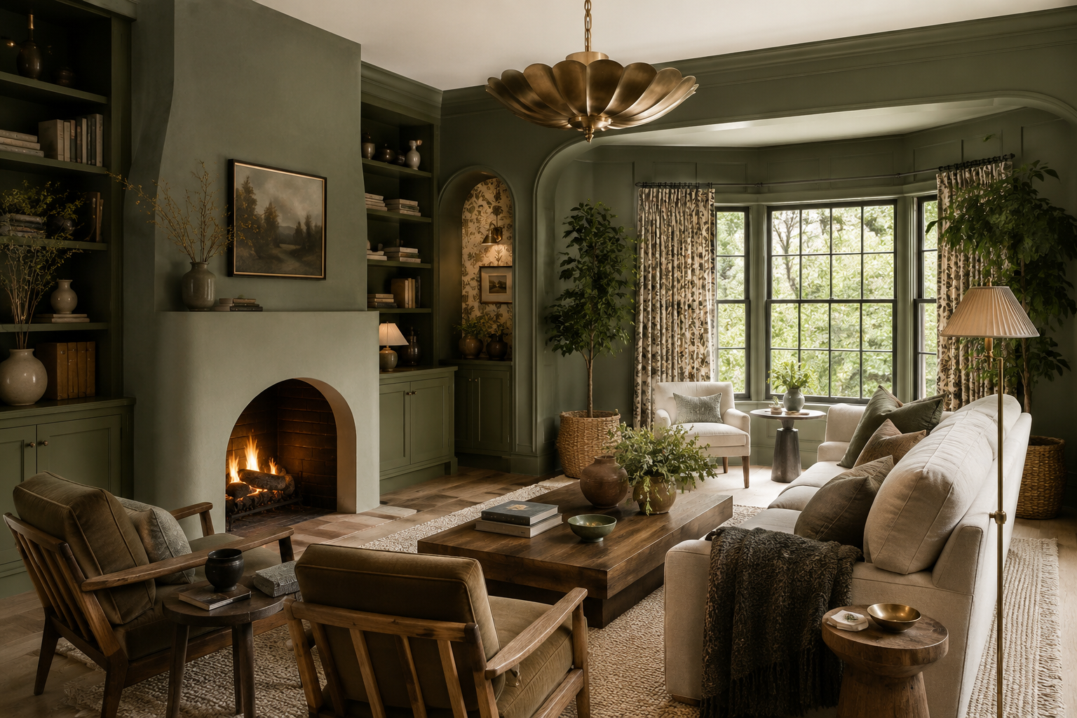
Earthy Greens
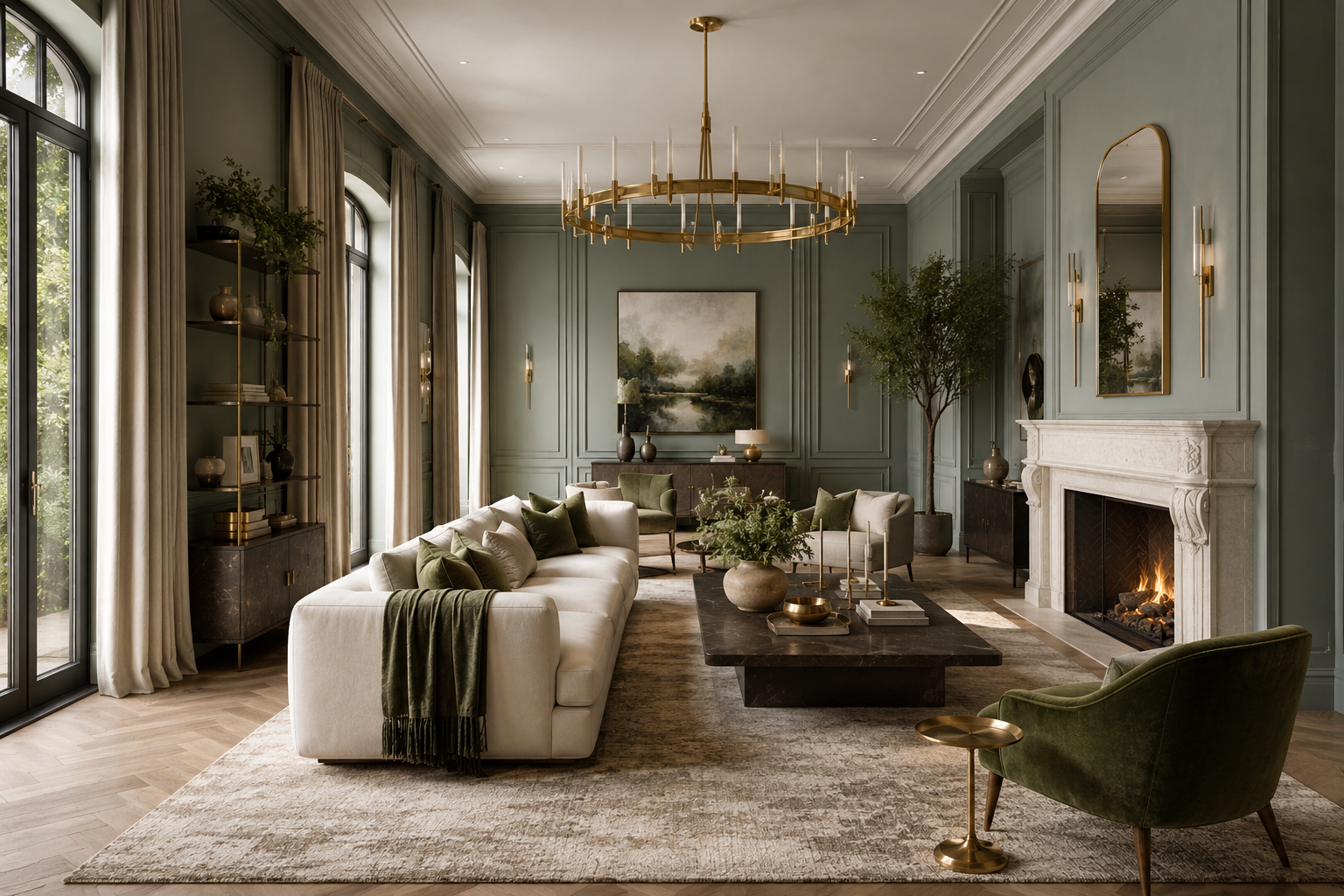
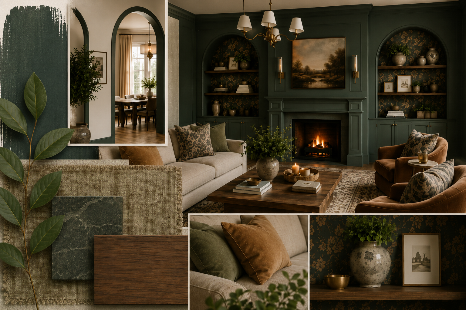
Earthy greens, particularly sage, olive, warm moss, and muted eucalyptus, have earned a permanent place in interior design because they feel both current and enduring. These tones reference nature in a way that reads as organic and grounded.
Sage works well in almost any room size and light condition, because it reads as a near-neutral while adding genuine color. Deeper olive and moss tones are more directional, pairing best with natural materials: linen, rattan, natural wood, stone, and ceramics.
Top picks:
- Sherwin-Williams Evergreen Fog (SW 9130) A muted sage-green with gray-blue undertones. Former Sherwin-Williams Color of the Year, still trending strongly.
- Valspar Warm Eucalyptus (8004-28F): Valspar's 2026 Color of the Year. A warm, nature-inspired green with soft gray undertones. Available at Lowe's.
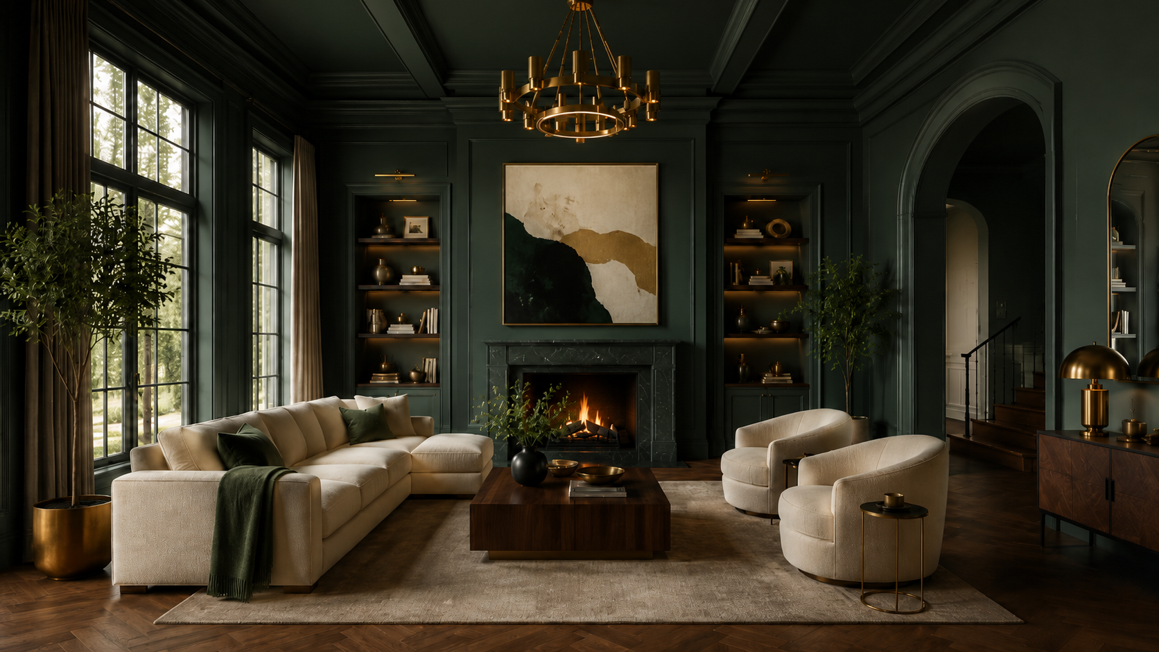
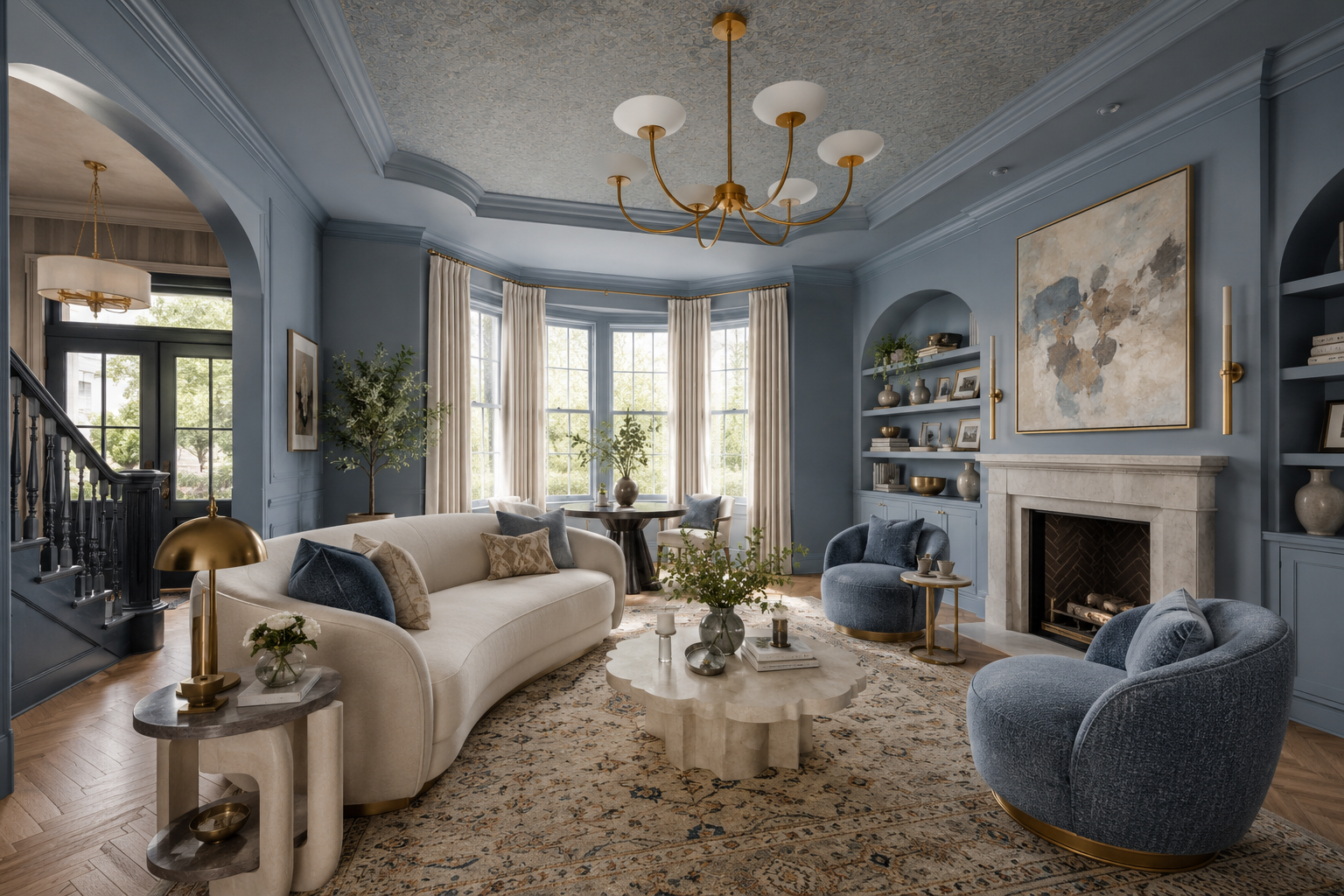
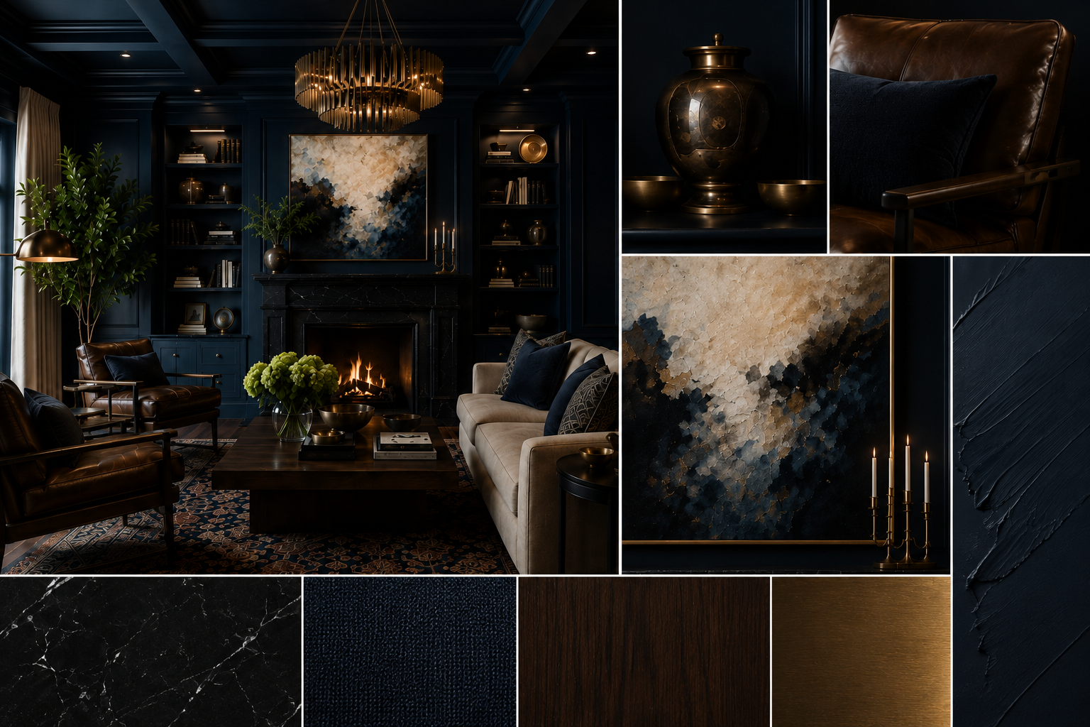
Moody Blues
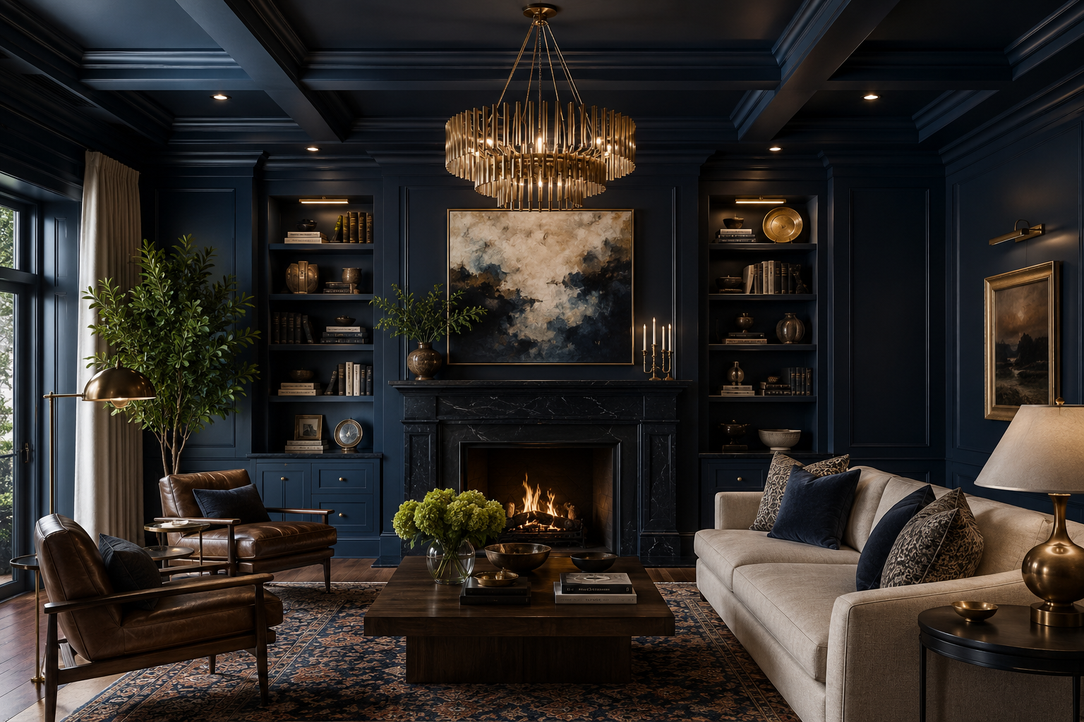
Deep blues have made a decisive shift from bold statement to widely embraced living room palette. Navy, slate, midnight, denim, and stormy cobalt all bring depth and intimacy to a space in a way that lighter colors simply cannot.
The key to making moody blues work is warmth in the surrounding elements. Pair a deep blue wall with warm-toned wood furniture, brass or gold hardware, warm white trim, and textured textiles like bouclé or woven wool to keep the space from reading cold.
Top picks:
- Benjamin Moore Van Deusen Blue (HC-156) A rich heritage navy. Popular for accent walls and full-room moody living rooms.
- Sherwin-Williams Indigo Batik (SW 7602) Deep indigo-blue with gray undertones. Bold accent wall option with a contemporary edge.
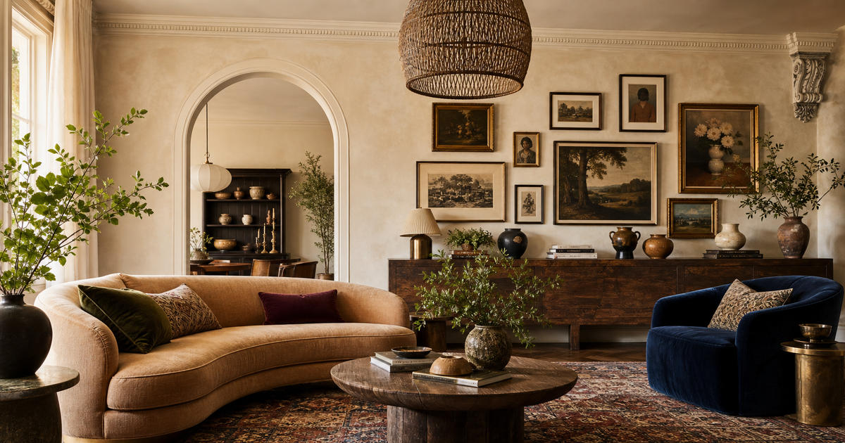
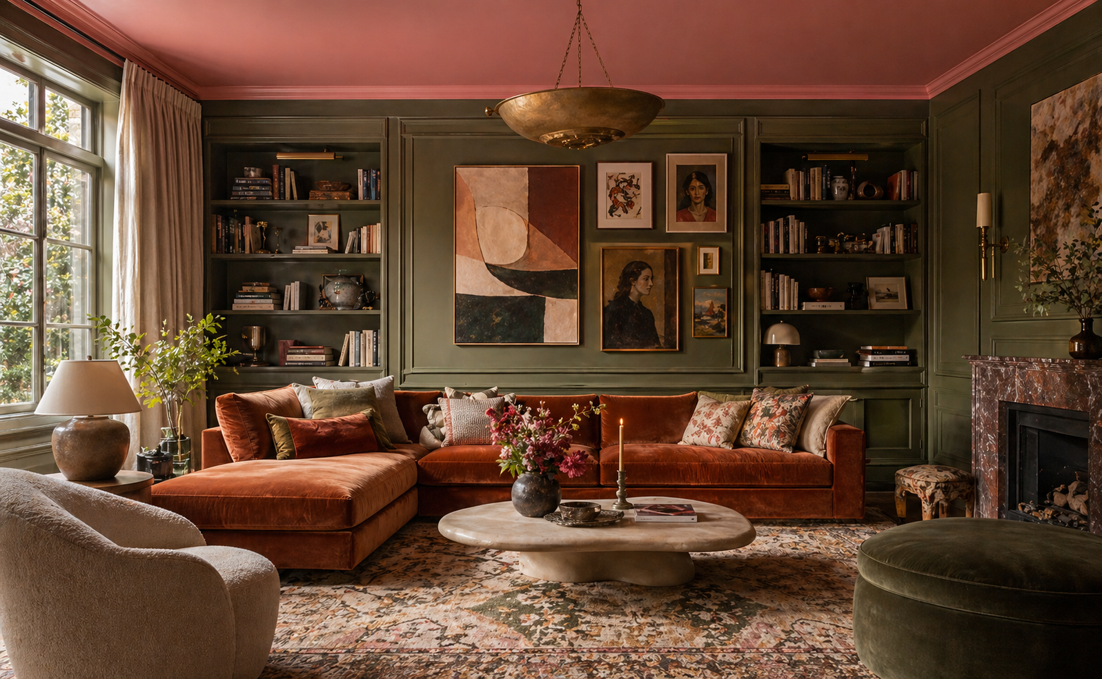
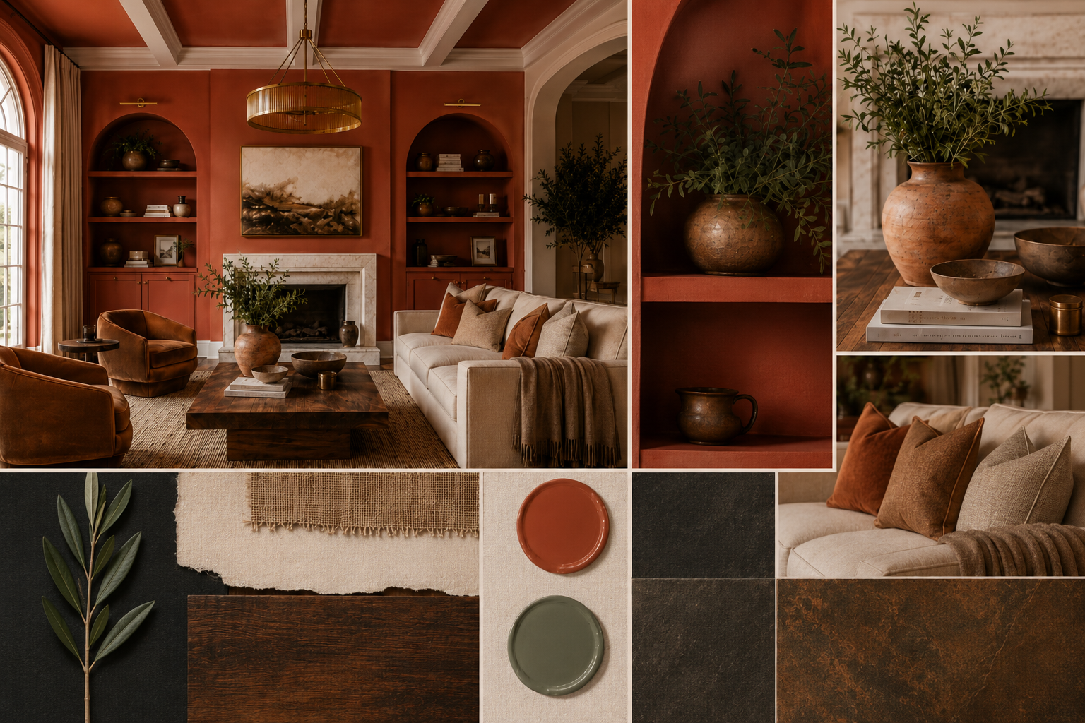
Bold Accent Colors
For rooms where you want maximum impact without a whole-room commitment, a bold accent color transforms the character of a living room when used strategically. These shades work best when they pick up on a tone already present in the room, reinforcing a note from the rug, a throw, or a piece of art.
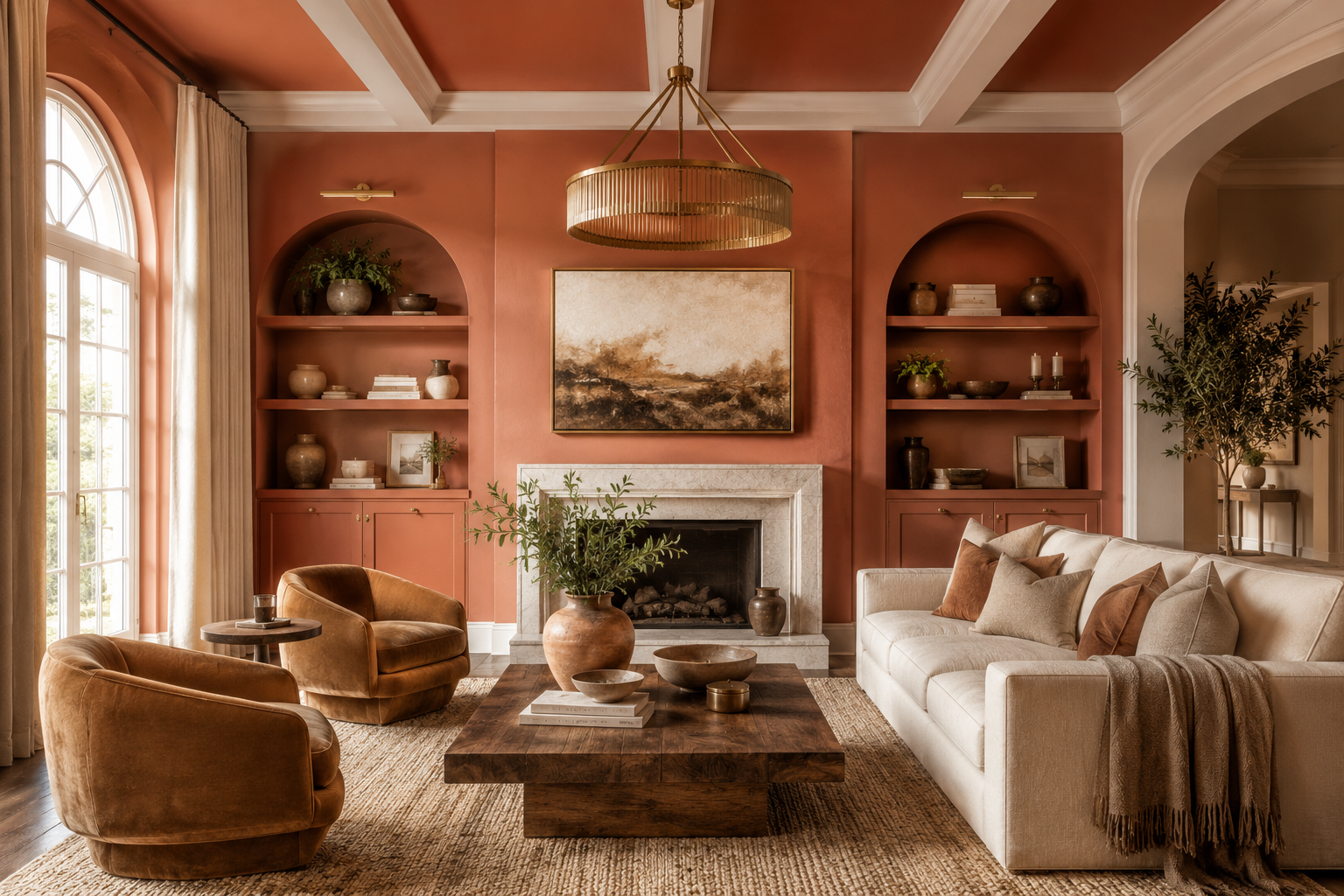
Top pick:
- Behr Hidden Gem (N430-6A): Behr's 2026 Color of the Year. A smoky jade-teal that pairs beautifully with warm wood furniture and brass accents. Available at Home Depot.
Ceiling Paint Strategy: The Fifth Wall
The ceiling is an underused design surface in most living rooms. In most homes, it ships with a flat white finish and stays that way indefinitely, which leaves real design opportunity untouched.
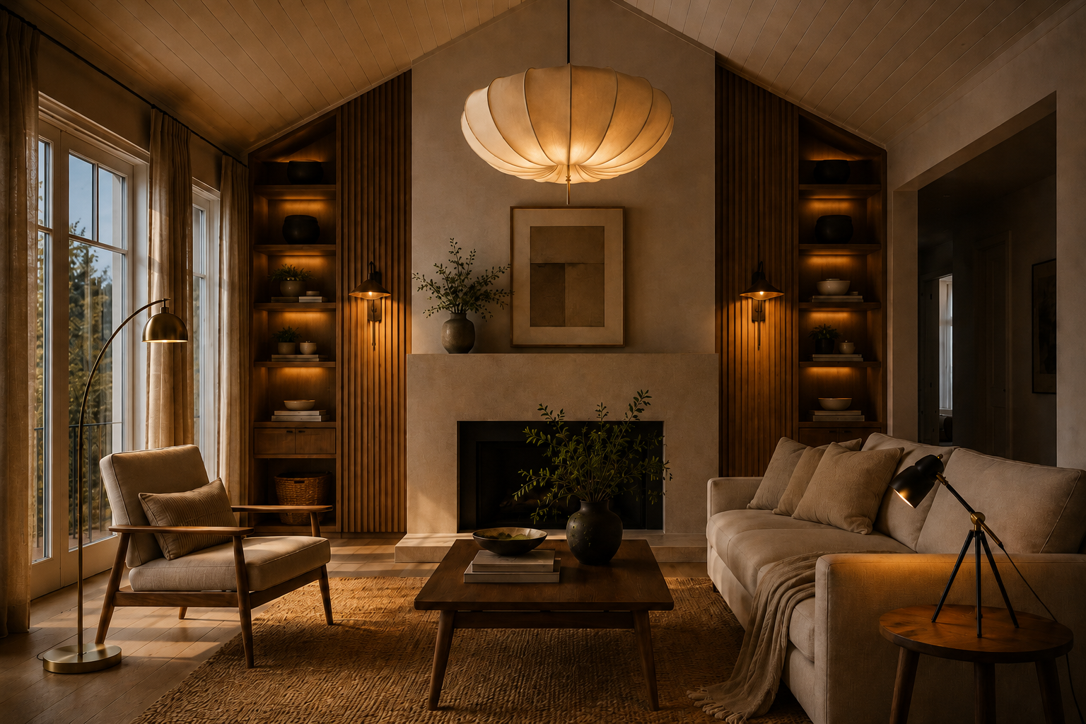
Same color as the walls. Painting the ceiling the same color as the walls (or one shade lighter) eliminates the visual stop between wall and ceiling and makes the room feel taller and more expansive. The room reads as a cocoon: fully enveloped in a single tone.
Bright white ceiling. The classic choice. A bright white ceiling creates contrast with colored walls, makes the room feel taller, and reflects light effectively. Try Behr Ultra Pure White Ceiling Flat for any of the palettes above. A dead-flat finish hides ceiling imperfections that eggshell and satin would highlight.
Accent ceiling. A bold color on the ceiling with white or neutral walls draws the eye up and creates drama without overwhelming the room. Deep navy, forest green, or a warm charcoal on the ceiling transforms the space completely.
Accent Walls
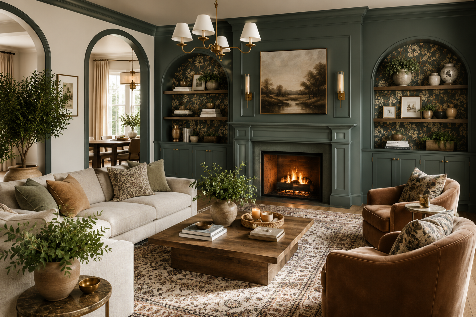
Accent walls work well when they highlight an architectural feature: a fireplace wall, a built-in bookcase wall, or a recessed niche. The wall you choose should be the one that commands attention naturally, not one you are forcing into the role.
In living rooms with fireplaces, painting the chimney breast in a contrasting color is almost always successful. The fireplace already commands attention, and the paint reinforces the focal point rather than creating one artificially.
Deep, saturated colors make stronger accent walls than light ones. If the rest of your room is neutral, even a warm terracotta or dusty sage will read as a confident accent.
Color and Furniture Pairing
Neutral paint, patterned furniture. If your sofa, rug, or curtains carry significant pattern or color, a soft neutral wall gives them room to breathe. Warm white, greige, or light sage work here.
Colored paint, neutral furniture. A sage or dusty blue wall with a cream sofa and natural wood furniture is one of the most reliably successful combinations.
Tonal layering. One of the most sophisticated approaches is tonal: walls, furniture, and textiles all drawn from the same color family at different saturations. Putty walls with a tan sofa, oatmeal rug, and caramel leather chair. Sage walls with a cream sofa, olive velvet cushions, and a hunter green throw. The room reads as effortlessly cohesive.
The rug as anchor. When in doubt about wall color, start with the rug. Choose a rug with at least two or three colors you love. Pick the most muted or secondary of those colors for the wall.
What to Buy First: Samples and Tools
Before committing to a full gallon, buy a sample pot. Live with the color across two or three days in different light conditions. Watch how it shifts from morning to evening and evaluate it alongside your furniture and textiles.
Sample pots:
- Behr 8 oz. sample pots at Home Depot (any color, about $4 each)
- Benjamin Moore sample pots available at BM dealers
Paint tools:
- Wooster Pro 9" Roller Cover 3-Pack Professional-grade, available at Home Depot (~$11)
- Purdy Pro-Extra Roller Cover Lint-free, professional finish, available on Amazon
- ScotchBlue Original Painter's Tape (2" x 60 yd) The most widely used painter's tape in the US
Your Next Living Room Starts Here
Living room paint ideas come down to one core principle: understand your space, then make a confident choice. Light direction, room proportions, existing furniture, and the mood you want to live in every day are all worth thinking through before you commit.
The best way to test a direction is with a large painted swatch or peel-and-stick sample taped directly to the wall. When the color looks right in your specific room, you will know. Your living room transformation is exactly one confident decision away.
Looking for furniture and decor to complement your new living room color? Browse collections at athomeplans.com curated to pair with both neutral and bold palettes.