How to Create a Gallery Wall That Actually Works
Target keyword: "how to make a gallery wall"
You have seen it a hundred times on Instagram: that perfect arrangement of frames, prints, and mirrors cascading up a staircase or anchoring a living room wall. You bought the frames. You hammered the nails. You stepped back.
And you thought: I can do better than this.
You were right. A gallery wall is one of the highest-impact changes you can make to a room — a chance to turn a blank wall into something curated, personal, and completely yours. This guide shows you exactly how.
1. What Makes a Gallery Wall Work
The difference between a gallery wall that stops people mid-step and one that quietly underwhelms comes down to three design principles — and all three are entirely learnable.
Contrast over uniformity. The most magnetic gallery walls mix sizes, finishes, and textures. When everything matches, the eye has nowhere to travel. Contrast is what creates the feeling of curation.
Scale that commands the space. A well-chosen arrangement anchors the wall and pulls the room together. Going slightly larger than feels comfortable is almost always the right call — a collection that fills its wall looks intentional; one that floats in it looks accidental.
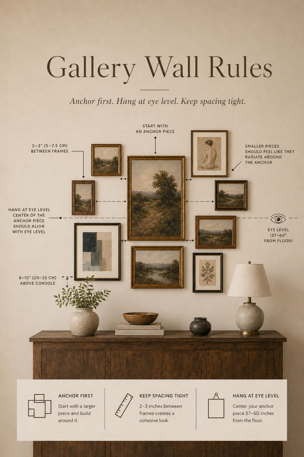
Eye-level placement. The visual center of any arrangement should land 57–60 inches from the floor — the same standard museums use, and the reason their displays feel so effortless.
2. Choosing Your Style
Before you select a single frame, choose the layout that suits your wall and room.
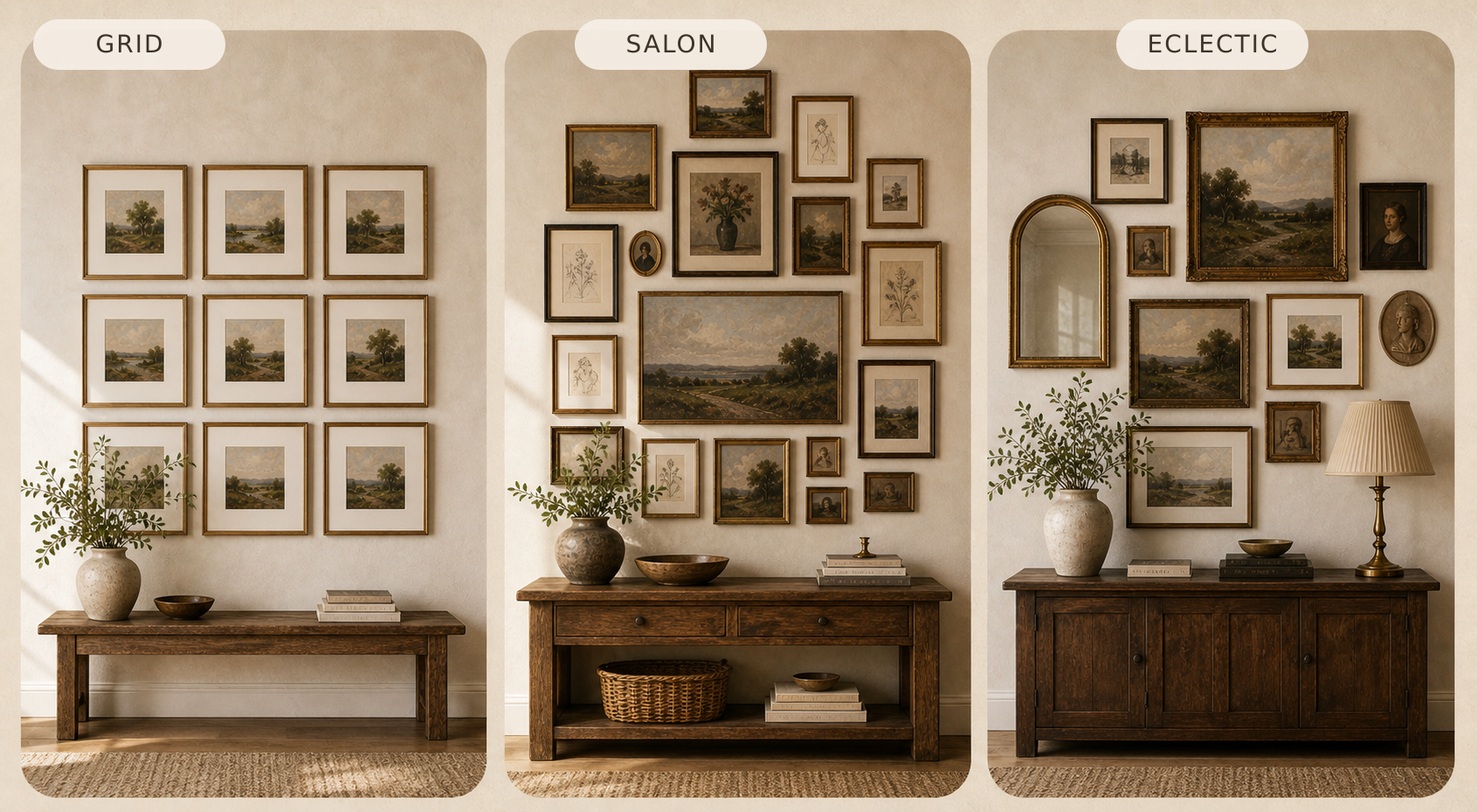
Grid gallery — identical frames, evenly spaced, in a clean rectangular arrangement. Works best in hallways, formal dining rooms, or anywhere you want calm and order. Pairs naturally with modern and Scandinavian interiors.
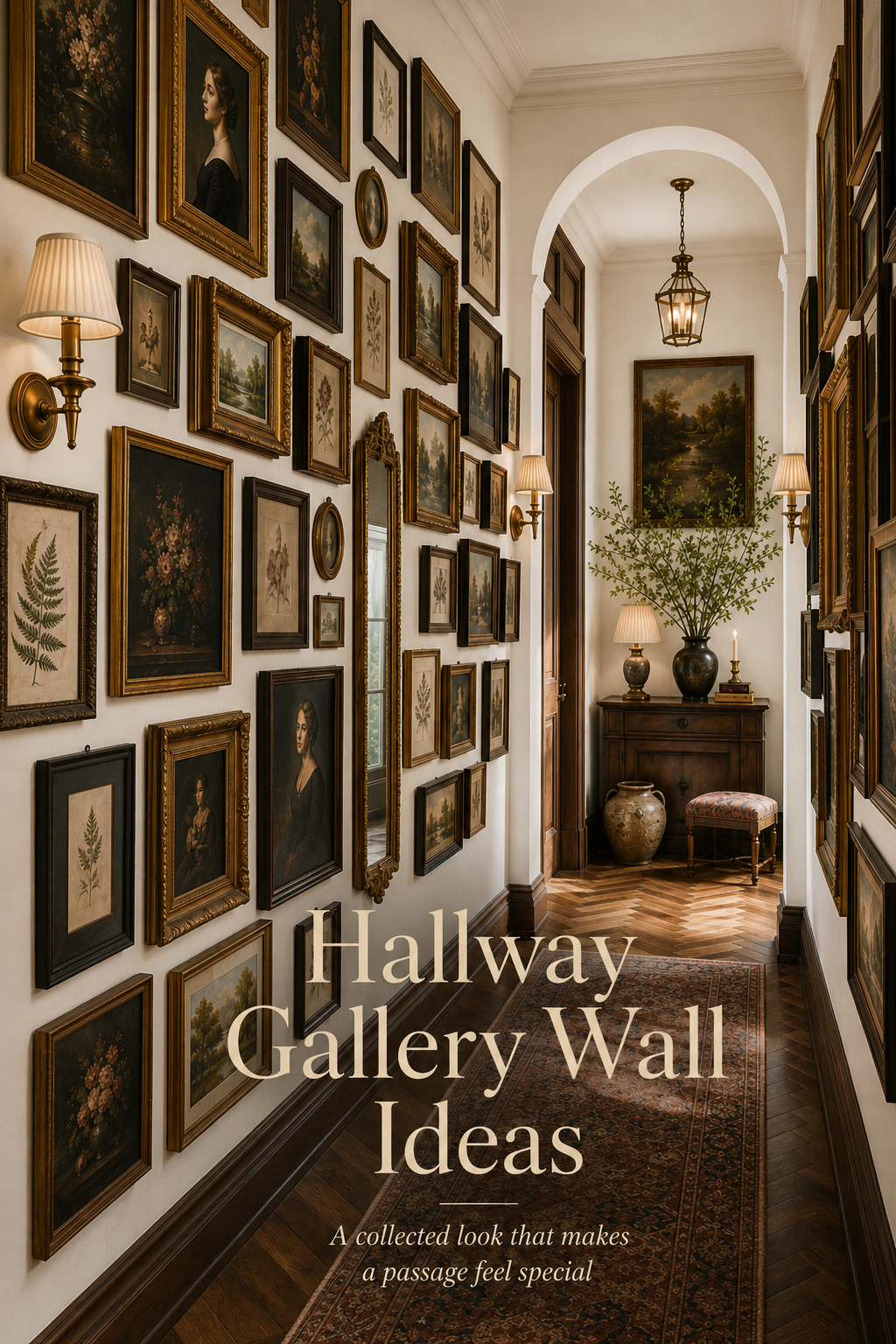
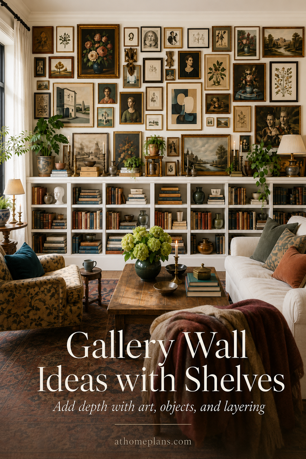
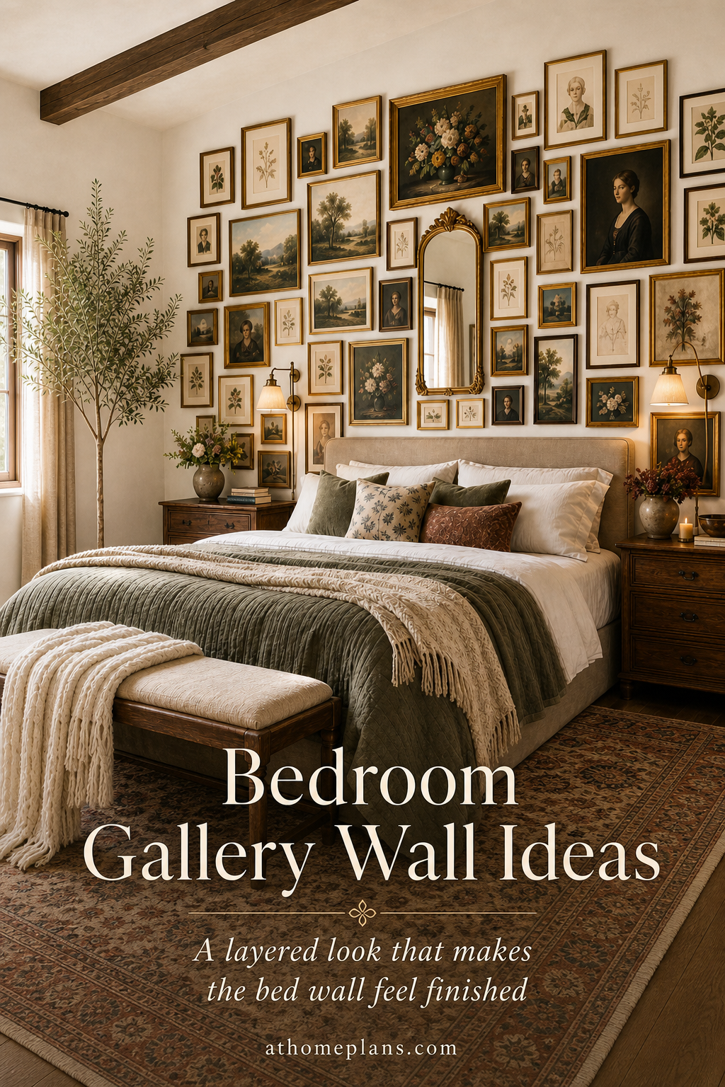
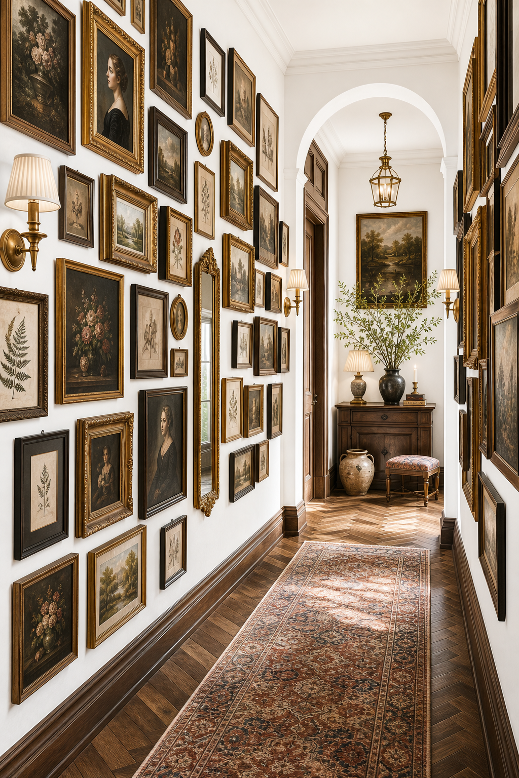
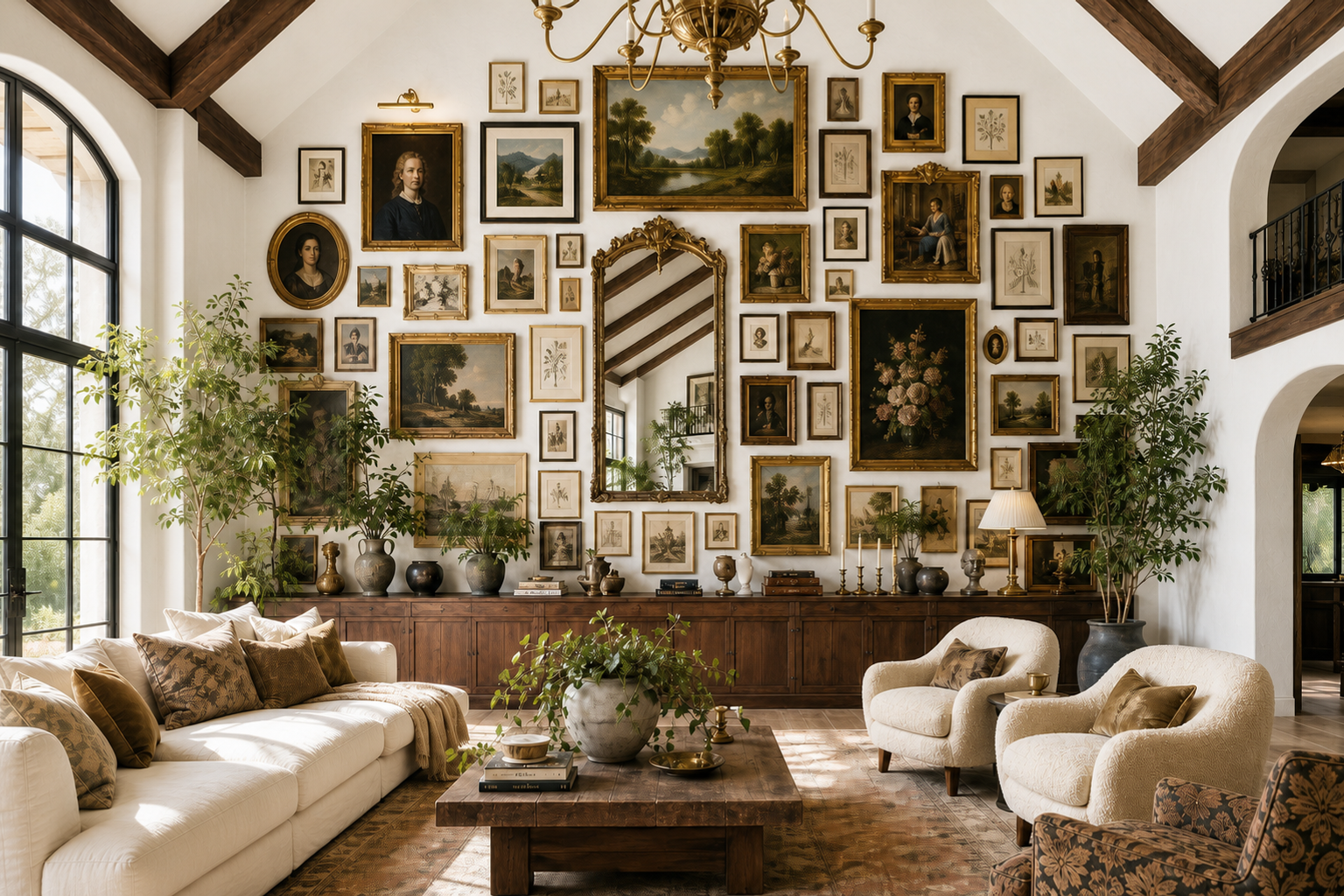
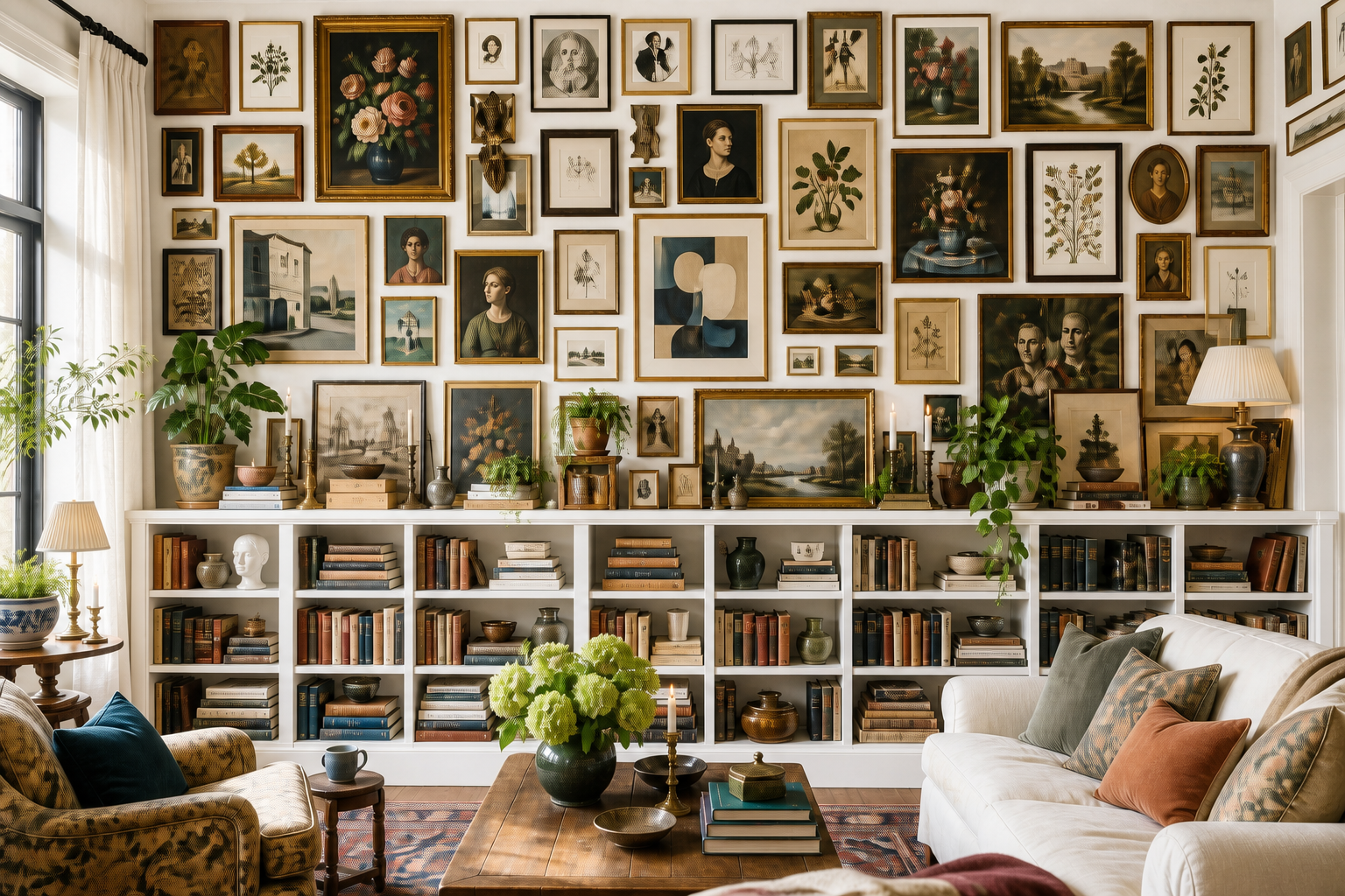
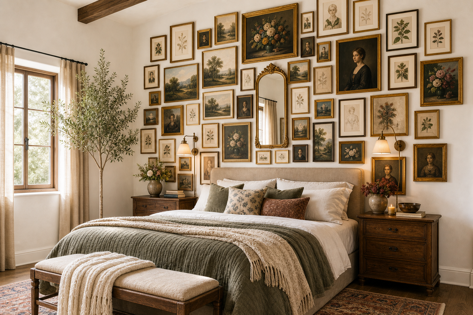
Salon wall — a floor-to-ceiling, edge-to-edge arrangement with varied sizes and minimal spacing. High-impact, high-effort, and best for large feature walls with confident decor.
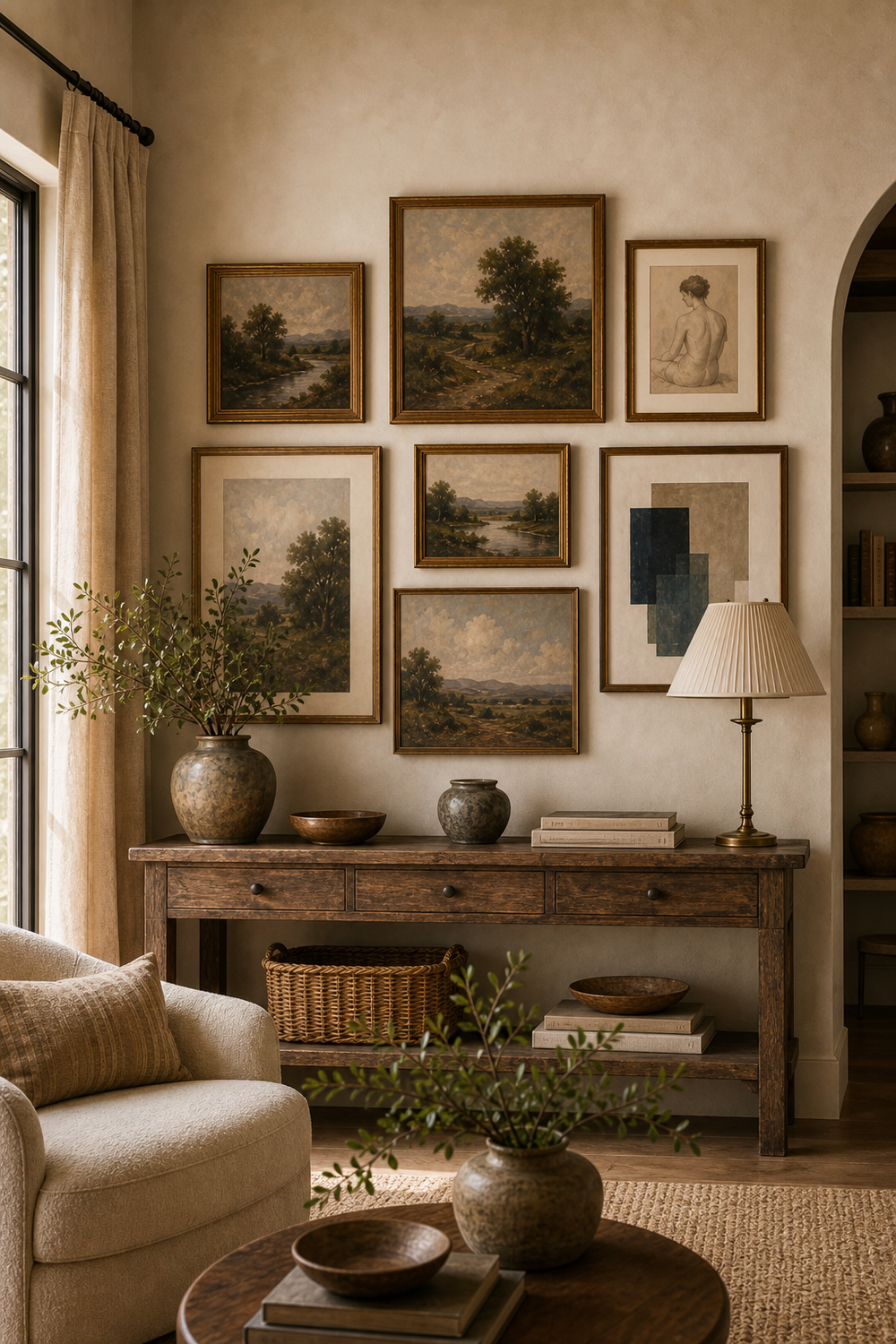
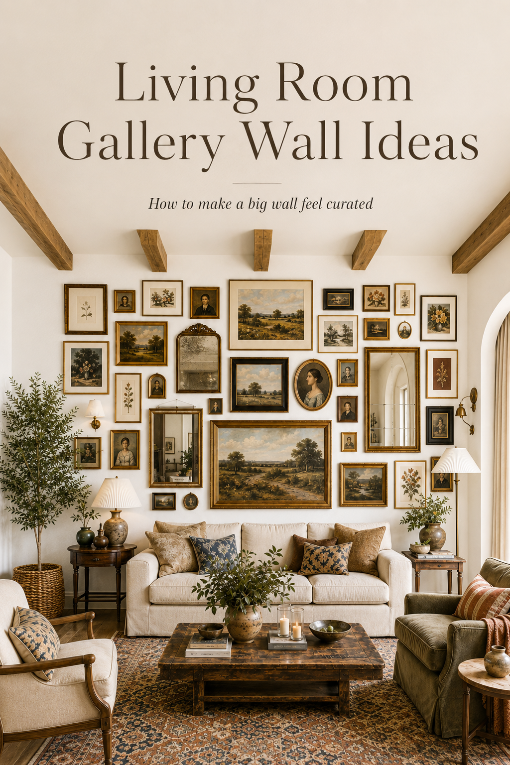
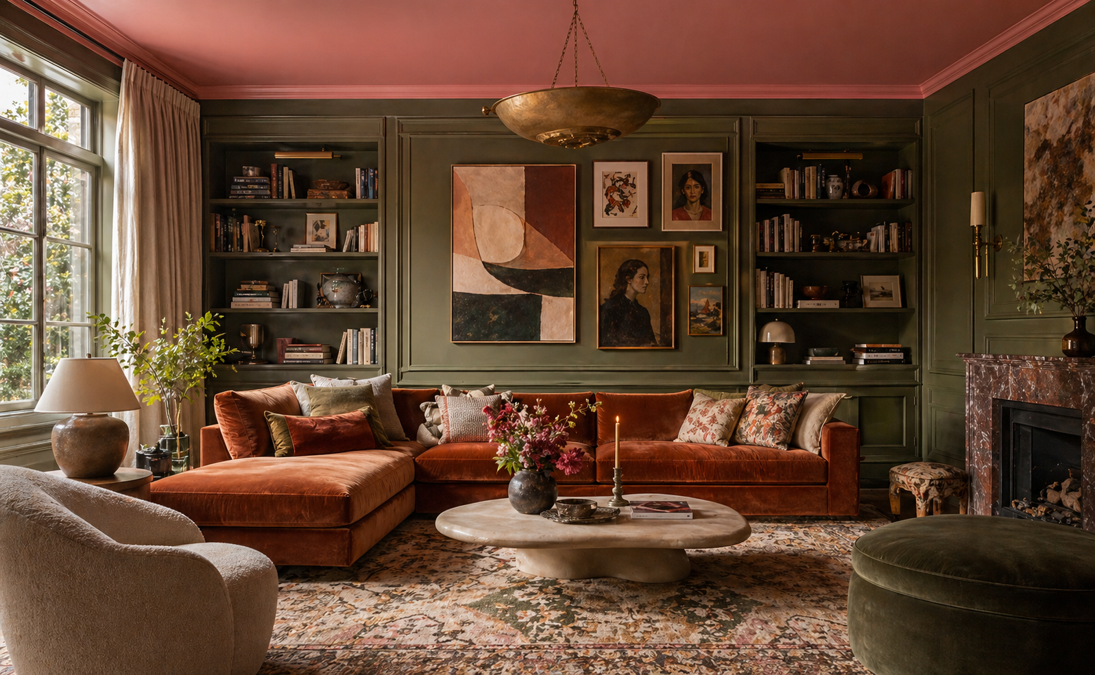
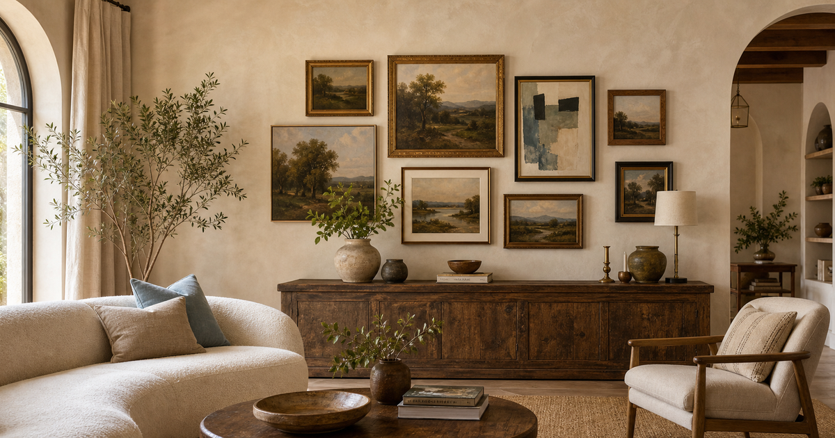
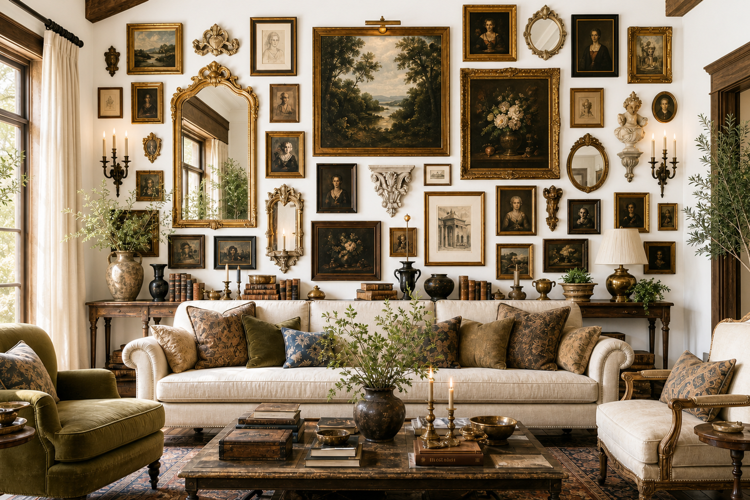
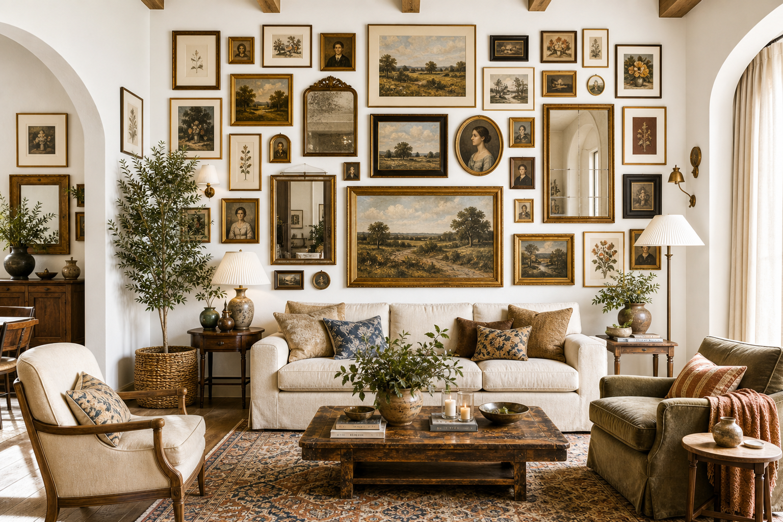
Eclectic mix — the most popular style and the most rewarding to build. Varied frame sizes, finishes, and a mix of art, mirrors, and objects. The rest of this guide focuses here.
How to choose: Stand in the room and look at your furniture. A gallery wall should feel like an extension of what is already there. Casual room? Go eclectic. Clean-lined furniture? Lean toward grid.
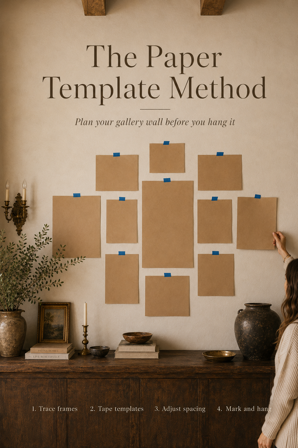
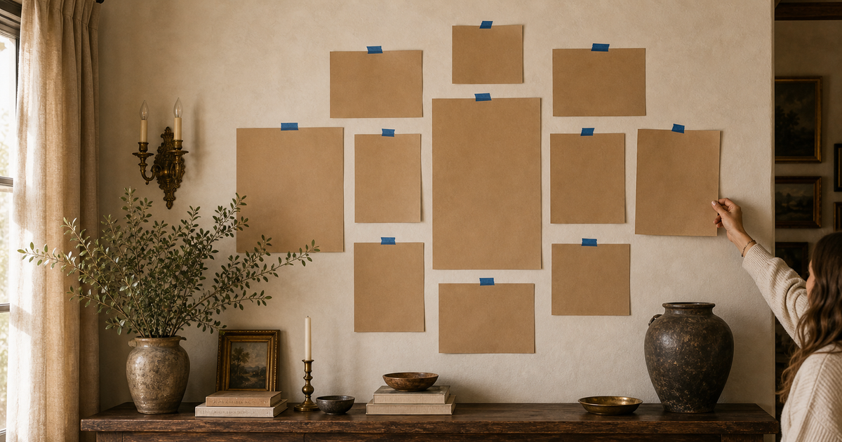
3. Planning Before You Hammer (The Paper Template Method)
This is the single step that separates a gallery wall that works from one that doesn't.
What you need: brown kraft paper or newspaper, scissors, painter's tape, and a pencil.
How it works:
- Trace each frame onto the paper and cut it out. Label each one on the back.
- Tape the paper templates to the wall where you think the frames will go.
- Step back. Move templates. Adjust spacing. Swap positions. Do this as many times as you need — it costs nothing.
- When you are happy, mark the hanging hardware position through the template before pulling it down.
- Hammer into the marks. Hang the actual frames.
This removes all the guesswork — and all the unnecessary holes in the wall. You will nail it (quite literally) on the first try.
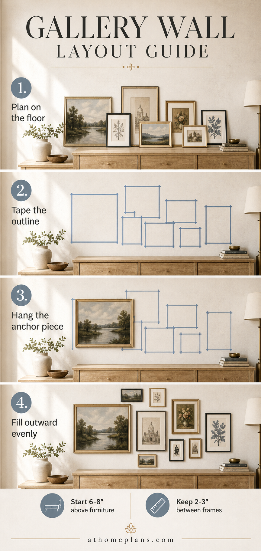
Pro tip — floor planning first: Before you tape anything to the wall, lay all your frames on the floor in front of the wall. Arrange them there until you find an order you love, then transfer that layout to your templates. The floor never lies.
4. Picking the Mix
A gallery wall that feels alive has variety across four dimensions: size, finish, depth, and theme.
Size: Aim for a mix of large, medium, and small. One large anchor piece, two or three mid-sized frames (8x10 to 11x14), and several smaller ones (4x6 to 5x7) to fill gaps. Let the large piece set the visual center.
Finish: Two to three frame finishes, maximum. Gold, black, and natural wood is a rich, versatile trio. What makes this combination work is contrast in character as much as color — try pairing a slim, minimalist black frame with an ornate gilded one. The tension between restrained and decorative is exactly what makes a wall feel designed rather than assembled.
Depth: Flat frames placed next to a protruding object — a small shelf, a sculptural piece, a woven wall hanging — add dimension that no photograph can replicate. Aim for at least one element that comes off the wall.
Theme — portraits meet abstracts: The most interesting gallery walls juxtapose rather than match. A graphic abstract print next to a classic portrait creates visual tension that makes the whole wall feel intentional and layered. Find the thread that connects them — color, era, mood — and let the subjects vary freely.
Color cohesion: Even an eclectic wall needs color logic. A useful rule: the dominant color in one piece should appear as an accent color in at least one adjacent piece. This creates a visual chain that passes the baton from frame to frame, making the whole arrangement read as one composed idea rather than a collection of unrelated objects.
5. The Anchor Piece — and Why It Changes Everything
Everything else on your gallery wall arranges around the anchor: the piece with the most visual weight.
An anchor does not have to be a framed print. A large mirror makes a powerful anchor — it adds light, creates the illusion of space, and breaks the visual rhythm of flat rectangles in a way no print can. Architectural elements work equally well: an ornate carved frame hung empty, a decorative relief panel, a dramatic clock face, a statement piece of architectural ornamentation. The key is genuine scale. The anchor should feel substantial — at least 16×20 for a standard wall, larger for a salon arrangement. When in doubt, go bigger. A too-small anchor is the most common reason an arrangement feels uncertain of itself.
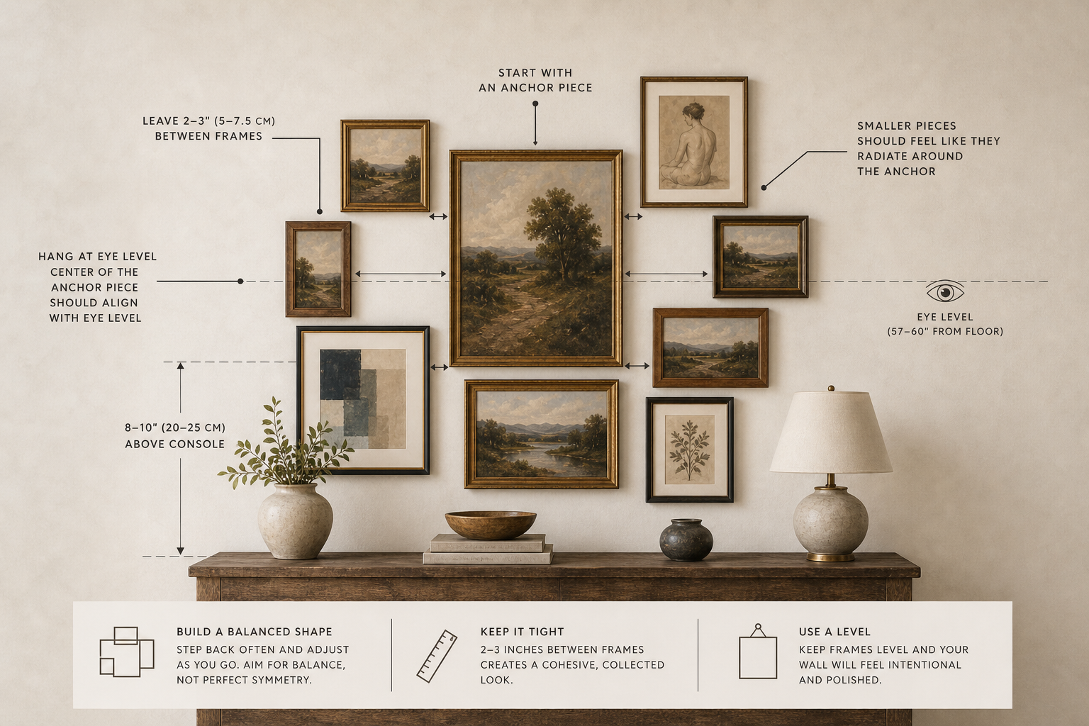
Hanging rules that always work:
- Eye level, always. The visual center of the arrangement — not the top frame — should sit 57–60 inches from the floor.
- Anchor first. Hang your most important piece first. Everything else arranges around it.
- Breathing room: 2–3 inches between frames for a classic gallery look. Tighter (1–1.5 inches) for a salon effect. Beyond 4 inches, the arrangement begins to dissolve into isolated objects.
- Align to furniture below. The gallery wall should sit within the width of the furniture beneath it. Extending beyond those edges makes the arrangement feel unmoored from the room.
6. Building Dimension — Beyond Flat Frames
A gallery wall made only of framed prints can still feel flat. The most compelling ones incorporate objects with real physical presence.
Mirrors add light and break up the visual rhythm of flat rectangular frames. Even one small round mirror shifts the energy of the entire arrangement and opens the wall.
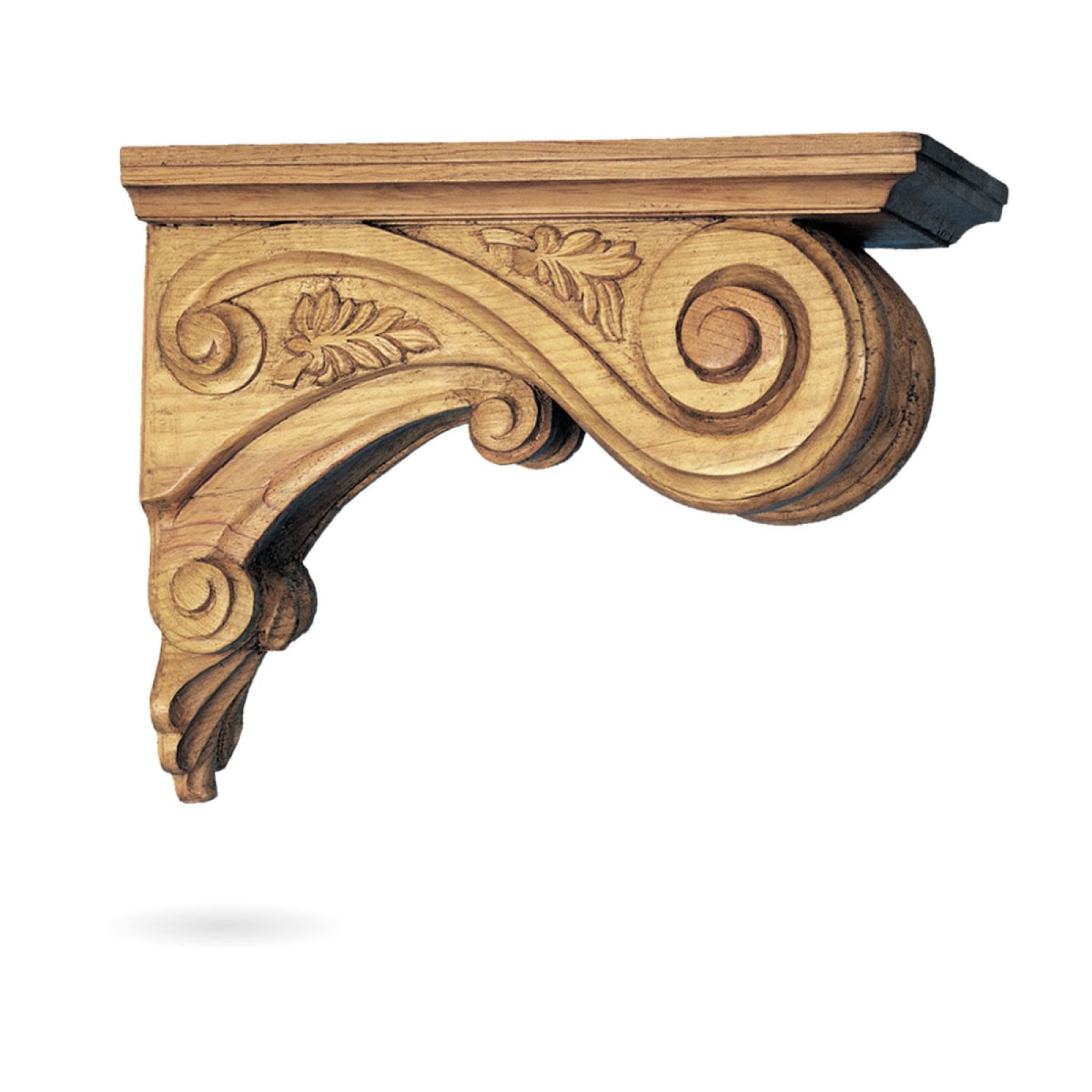
Architectural ornamentation — a decorative corbel, an ornate empty frame, a carved relief panel — adds historical texture and a sense of depth that no print can replicate. These pieces are especially powerful as anchors or as counterpoints to minimalist frames.
Candle holders and sculptural pieces bring warmth and three-dimensionality. A wall-mounted candle sconce, a small bronze figure, or a ceramic sculptural form can anchor a corner where a frame would feel awkward. They also introduce materials — metal, ceramic, wax — that paint and paper simply cannot.
Plant holders and living elements: A wall-mounted planter with trailing greenery introduces organic texture that softens even the most structured arrangement. It breaks the "art gallery" formality and makes the wall feel genuinely lived-in.
Small shelves and ledges let you layer art — lean a print against a frame, add a small object, rotate the display seasonally without touching a nail. Especially forgiving for renters and chronic rearrangers.
7. The Details That Take It Further
These are the choices that move a gallery wall from good to great.
- Let frame characters contrast. A slim, clean black frame living next to a heavily detailed gold one — the tension between minimalist and ornate is the point, and it is what makes the wall feel designed.
- Pull the arrangement in. Gaps between frames larger than the frames themselves dissolve the collection into isolated objects. Tighter spacing almost always reads better.
- Anchor to the furniture line. Hang the collection above the sofa or console — the piece below matters as much as the wall above.
- Start big, fill small. Always position your anchor first and build outward. Starting with small frames leaves no visual room for the large piece to breathe.
- Let the color chain lead. Use the dominant-to-accent color rule as you sequence your pieces. When colors pass the baton from piece to piece, the wall reads as one composed idea.
Shop the Look
Vintage + maximalist direction. All picks from US retailers.
Minimalist Black Frames — Wayfair Basics by Wayfair Drennon 7-piece gallery wall frame set with glass front. The contrast anchor for a vintage-maximalist arrangement — slim profiles let the ornate gold pieces command attention.
Ornate Gold Frames — Wayfair Latitude Run Vintage Baroque Gallery Wall Frames, 7-piece set, gold. Carved ornate detail in antique gold finish — the statement anchor piece that changes the character of the entire wall.
Architectural Corbels — Wayfair Ekena Millwork Small Acanthus Pilaster Wood Corbels, 4-pack. The element that signals "designed, not decorated." Natural wood texture adds historical depth no print can replicate.
Wall Candle Sconces — Wayfair Rosdorf Park Set of 2 Wall Mount Candle Holder Pillar — Black. Iron finish wall sconces bring warmth and three-dimensionality to the arrangement. A pair flanking your anchor piece is an instant focal point.
Maximalist Prints — Amazon Eclectic multi-print set — portraits, abstracts, and vintage-inspired pieces that mix exactly as the article describes. (ArtistryHouse brand store — charcoal and botanical print sets)
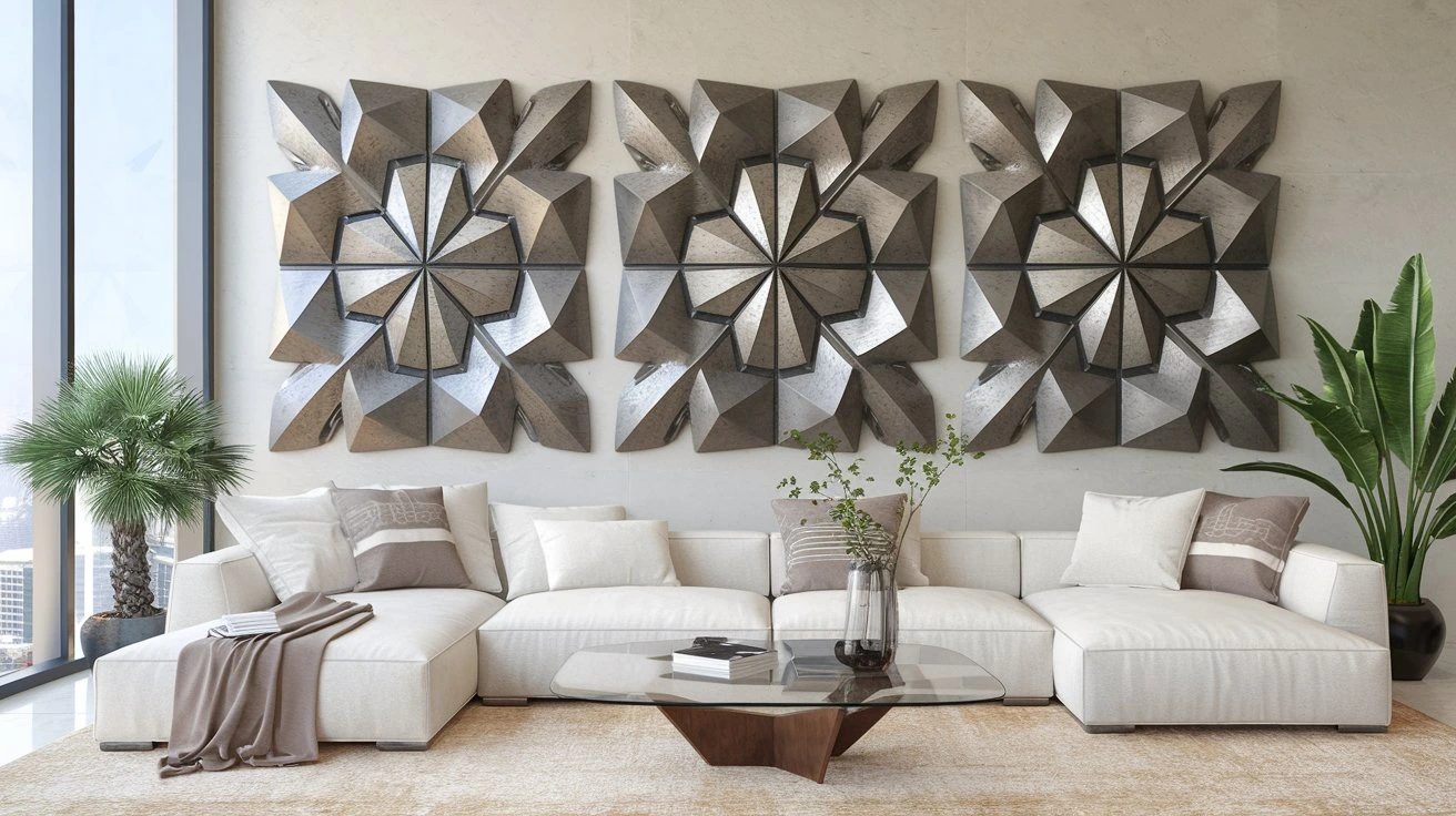
3D Wall Sculpture — Amazon Dimensional wall art that adds physical depth to the arrangement. Even one sculptural piece transforms the energy of an otherwise flat collection of frames.
Focal Mirror — Amazon A statement mirror as the anchor piece — adds light, creates spatial illusion, and breaks the visual rhythm of rectangular frames in a way no print can.
The Bottom Line
Learning how to make a gallery wall is about unlocking a design skill you already have the instincts for. The paper template method removes the guesswork. The anchor — whether a large mirror, an architectural piece, or an ornate gold frame — gives everything else a place to live. The mix of minimalist black next to baroque gold with natural wood is the combination that works in nearly every room. And when the dominant color of one piece appears as an accent in the next, the whole arrangement stops looking assembled and starts looking designed.
You bought the frames. Now make it great.